Creating a responsive website for my local boxing gym while maintaining their core values and offerings to their community.
Seattle Boxing Gym (SBG), founded in 1990, needs a website revamp to showcase its unique fitness blend and strong community. The challenge is to create a modern online platform that effectively communicates SBG's excellence, fosters community engagement, and attracts a wider digital audience.
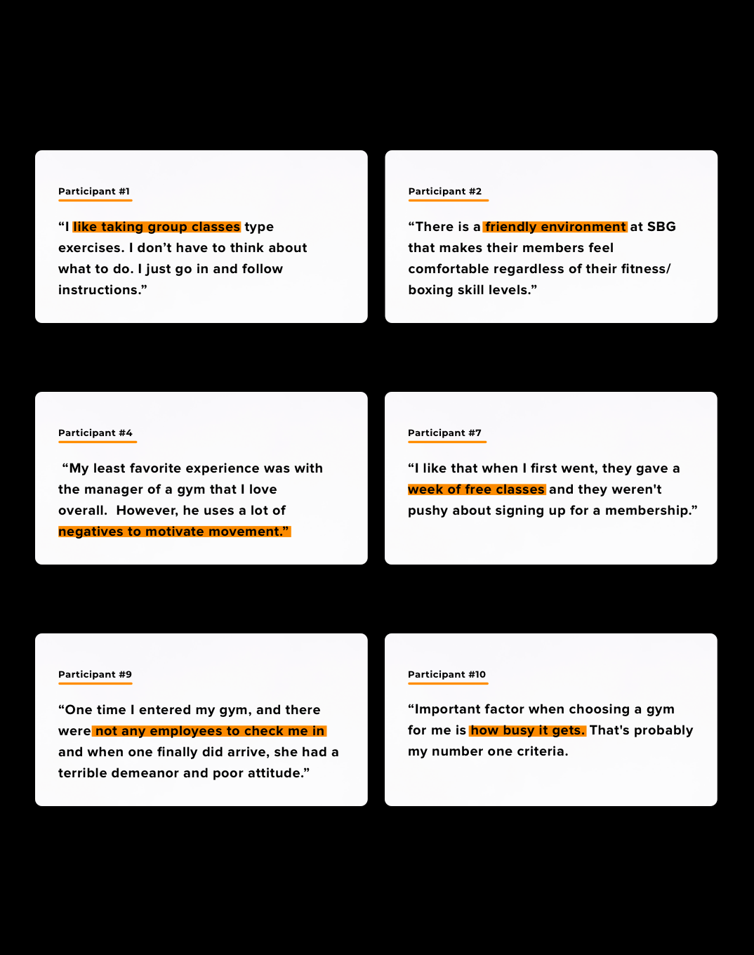
To be able to understand how one might create a website that works for possible new customers and recurring members, I had to first understand and identify the goals, needs, motivations, and frustrations those customers feel towards gym memberships in general and specifically towards boxing.
I began by creating a research plan that would help keep me organized and on track for such a quick research phase. My goals were to conduct one-on- one interviews and surveys, as well as contextual inquiries of the current site with current members and possible first time customers. By doing contextual inquiry of the current website, I could find insights and patterns on users’ digital experience with SBG’s current website. I also wanted to study SBG’s local competitor’s website and offerings in order to discover if there could be any advantage that could help SBG stand out.
• Research Types: 1–1 Interviews, Survey, Contextual Inquiry
• Total Participants: 11 Total ( 7 Men, 4 Women)
• Age Groups: 18–40 year olds (All Millennials)
• Boxing Experience: 5 participants
Through the research, I was able to identify some needs, pain points, and motivations of these shoppers that were really helpful.
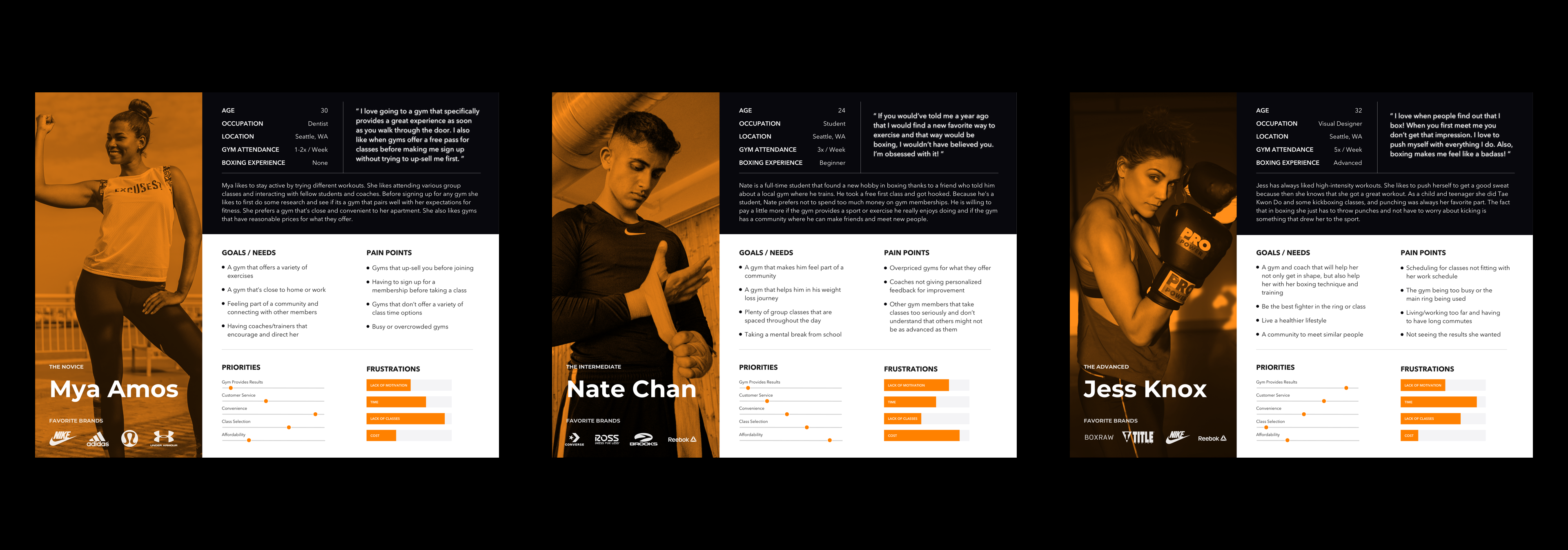
Based on what I uncovered during research, I synthesized the findings and created a realistic representation of the 3 key audiences in the form of personas. The personas range from customers who have no boxing experience to those who are more advanced in their training.
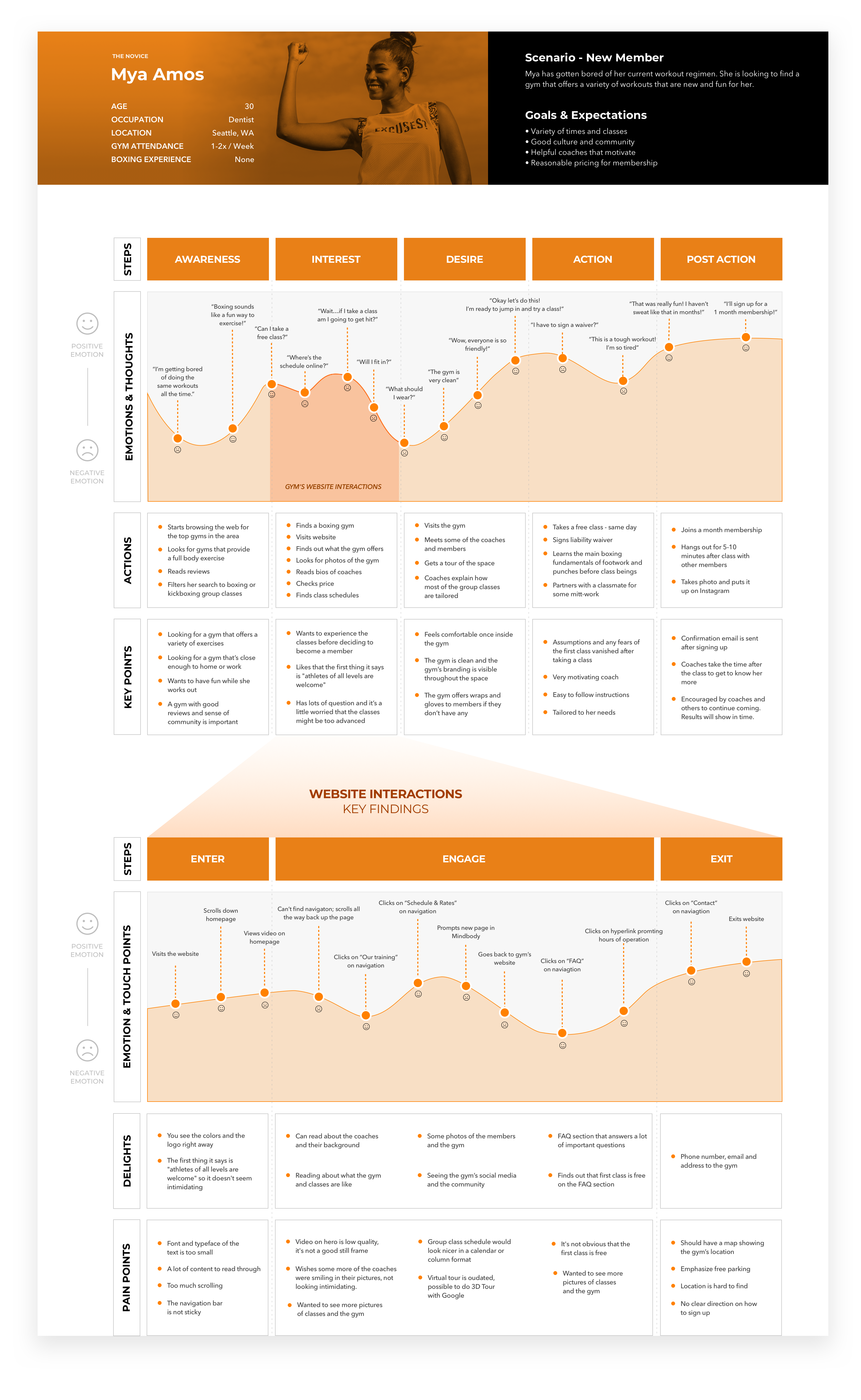
It was important to gain insights into common customer pain points when it comes to joining or visiting the gym for the first time. A customer journey map would help SBG step into the customer’s shoes and help them see their gym’s offerings from the customer’s perspective. Doing this could help improve the customer experience for those that visit the gym for the first time who are looking for more information before signing up.
Competitive Audit
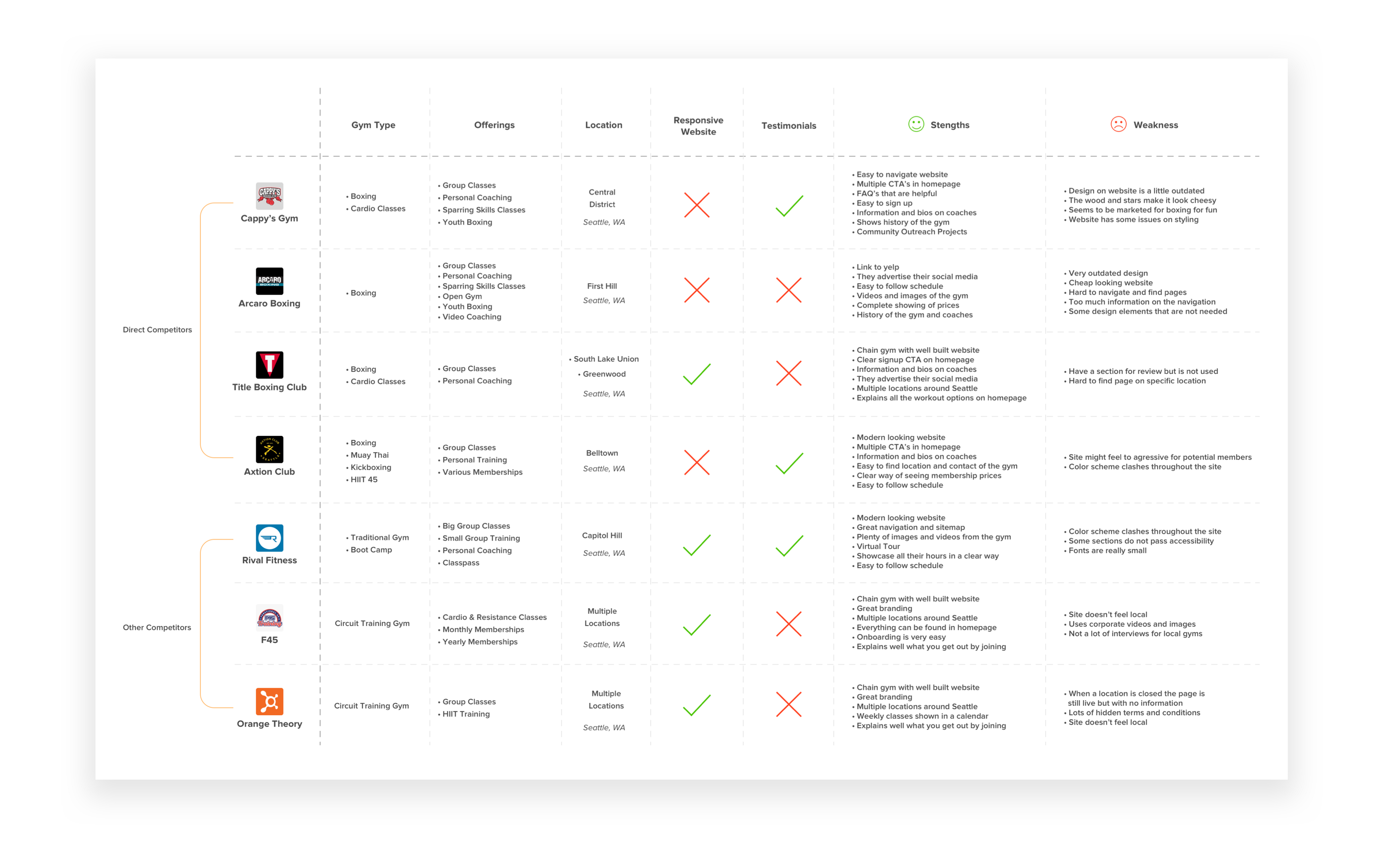
Before moving into the ideate phase, I wanted to make sure that SBG stood out next to the local competition in Seattle when it came to their website. By identifying what the competitors did well and what they lacked, we could help place SBG in a stronger position in the local market. It was important to learn a little bit about what the industry standards were for features in this space before moving forward as well. I performed an in-depth competitive analysis of features, products and services provided for all the direct competitors as well as the indirect ones.
I wanted to still deliver everything in the project goals on time, I created an in-depth product feature roadmap, with features presented in order of priority in terms of development, investment, and importance to business and user goals.
Site Map
Thanks to the findings from the contextual inquiry during the research phase, I was able to discover ways to improve the current information architecture used on current website.

Even though it was important to design a website that was tailored to potential new customers, it was still important to keep the recurring members in mind as they also visit the website regularly to sign up for private and group classes. I identified the main user flows that each persona typically follows when visiting the current website. The flows range from signing up for a group class or private session to finding out more information before deciding to join.

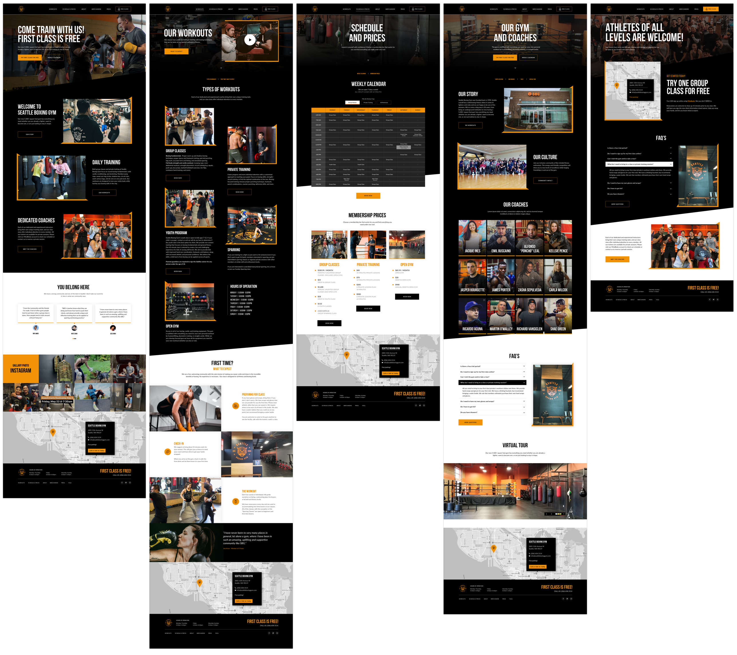
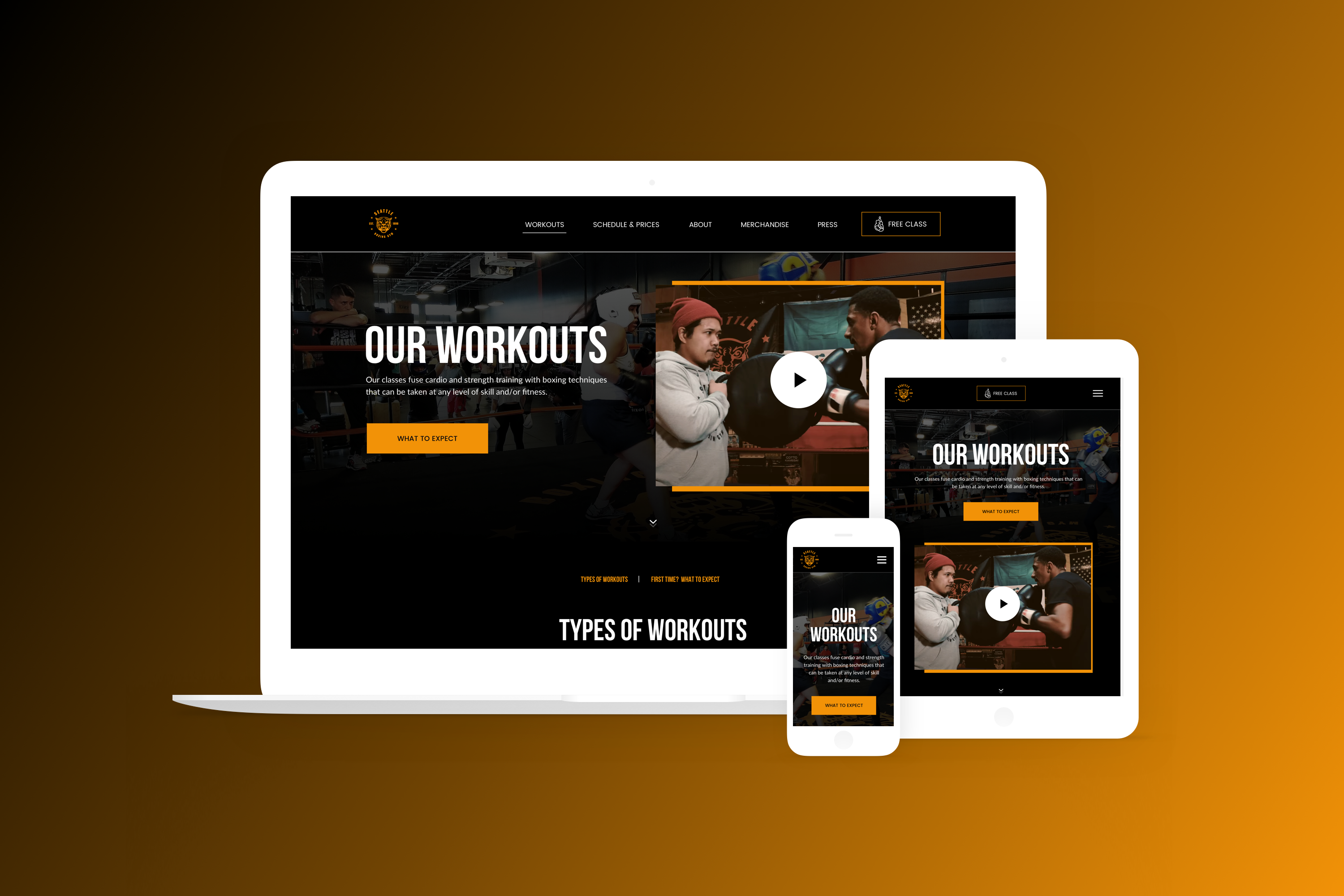
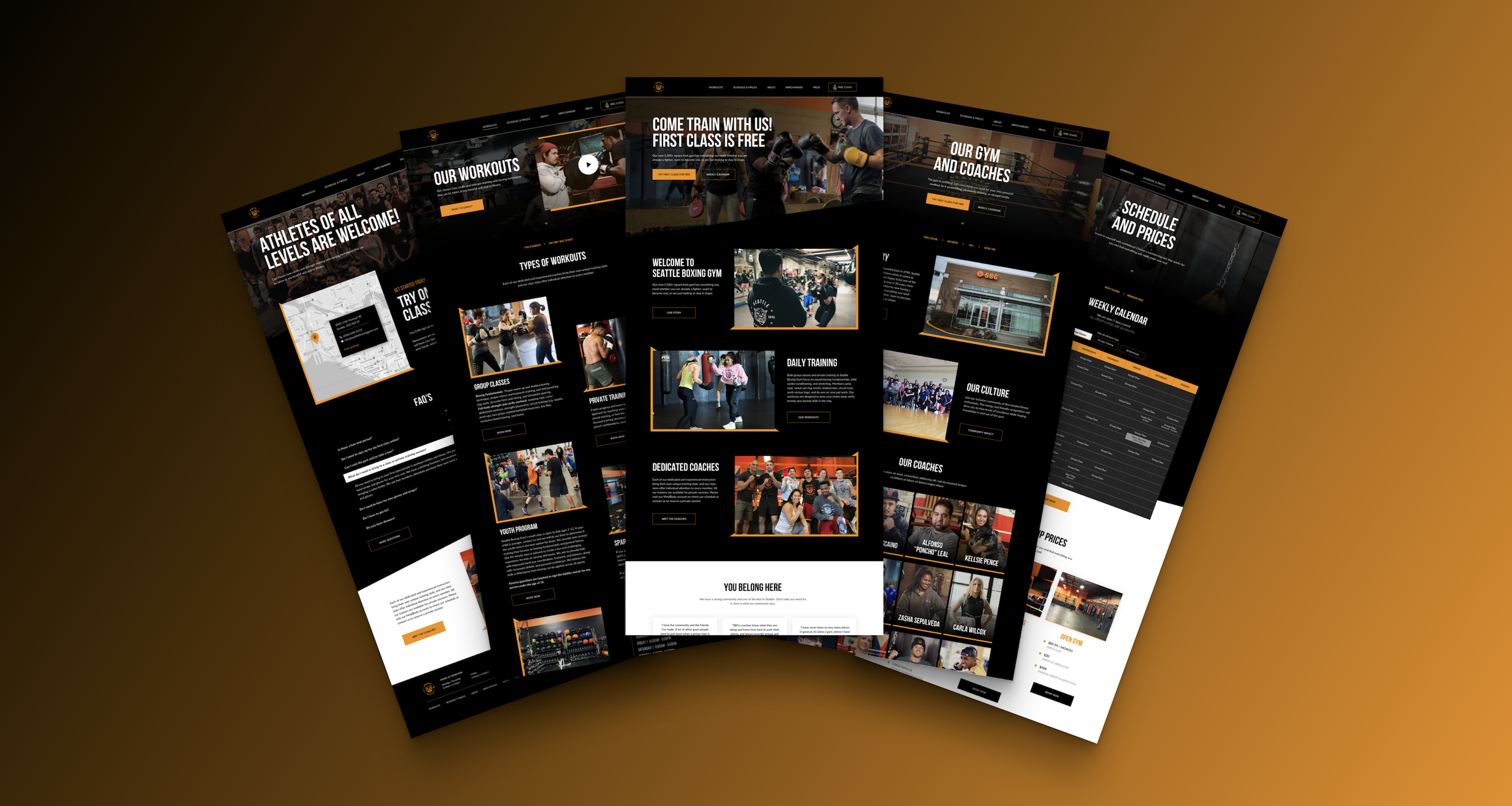
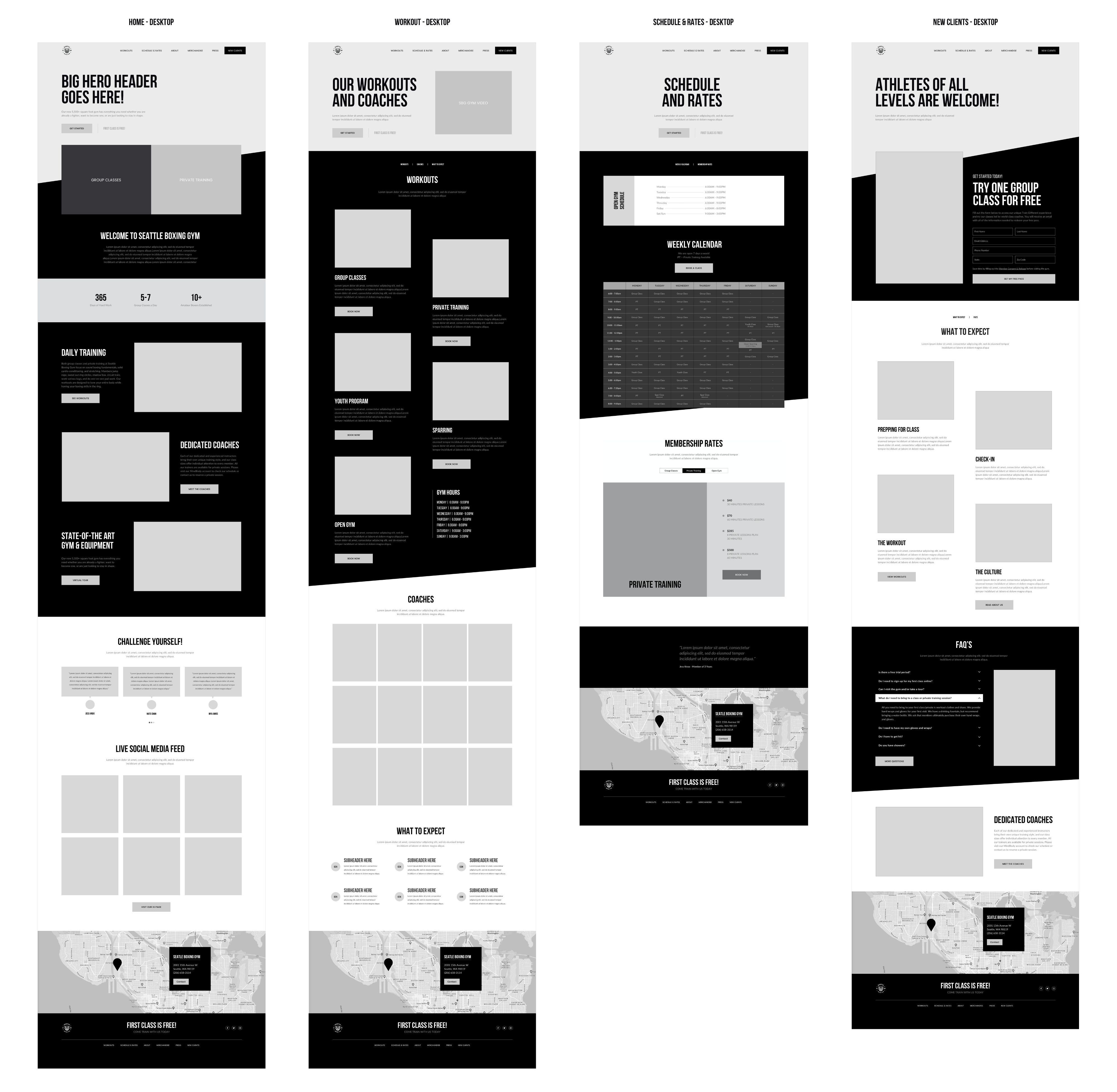
Once user flows and information architecture had been established, I began to build out the key pages that would be needed to create the new website. Since this project was to create a responsive website, I was mindful to design the mid fidelity wireframes with sections that easily scaled from different screen resolutions.
Once the mid fidelity wireframes for multiple pages were created, I wanted to test the usability of the design before moving forward and creating the responsive pages. The goal was to assess the usability of the web interface design, user flow, and information architecture. In the same fashion as with the user interviews, I started by creating a usability testing plan. This time I recruited people that weren’t part of the gym but that fit the characteristics of the target audience. I created a prototype using InVision and then used Maze to conduct a self-administered usability test that could be done remotely.
1. Find the cost of a monthly Open Gym plan.
2. Sign up for a Free Class.
3. Find out what you need to bring to your first class or private training session.
4. Find the times offered for private training.
5. Learn more about a coach at the gym.
A total of 14 participants were used for this round of testing. 4 of the participants agreed to jump on a virtual Zoom call and screen share while testing the prototype. Remote participants spoke out their actions and thinking while I observed while making sure I could assist at any point if needed. Participants were timed on how quickly they completed those tasks. At the end of the tests, participants rated each task on a scale of 1(very difficult)– 10(very easy).
of users accomplished the tasks via unexpected paths.
of users found the website pretty easy to navigate.
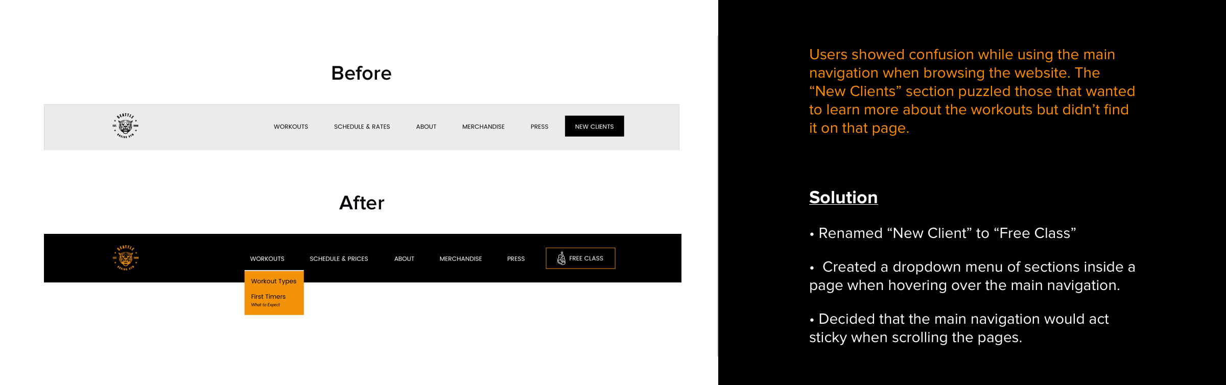
CTA on “Homepage” stands out and all users clicked on it.
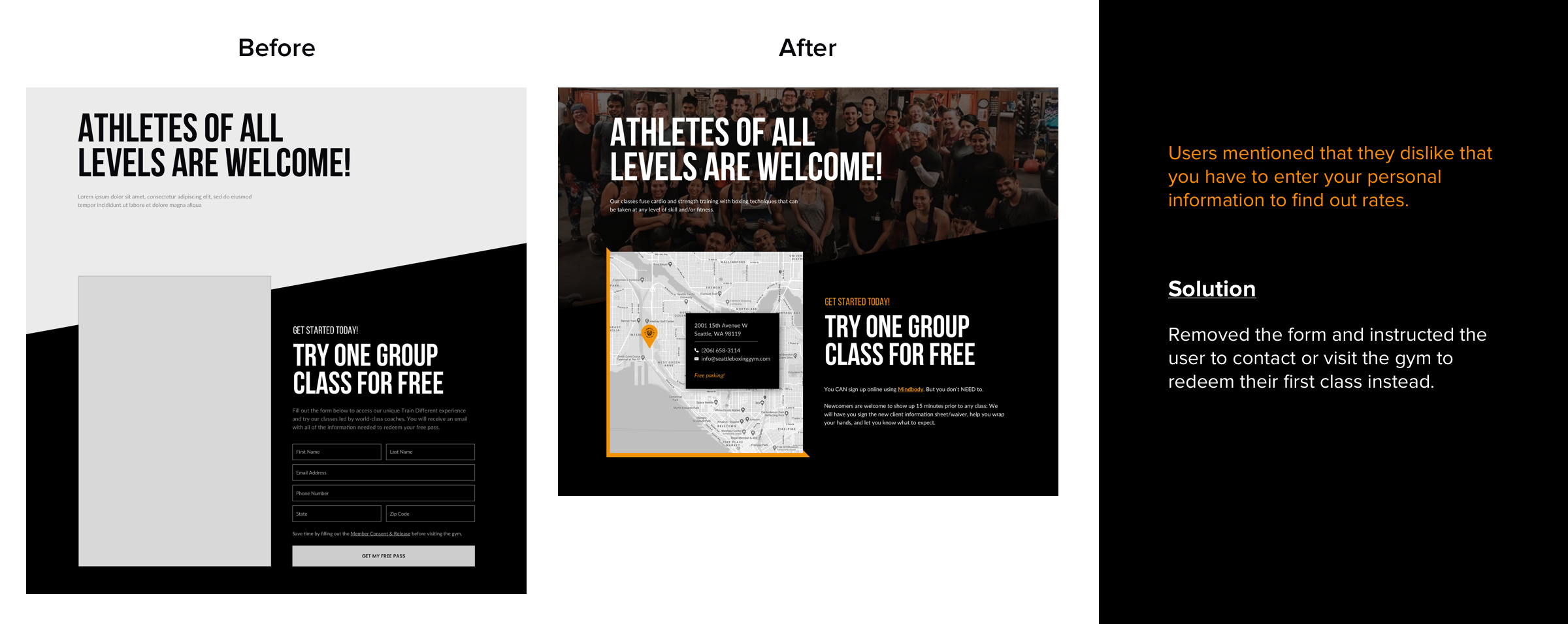
pointed out that they don’t like to enter personal information for a free trial.


Since I had already created sections that easily scaled for different screen resolutions, I started to build out the responsive pages with branding and imagery. I then decided to update and redo the prototype on InVision from scratch to showcase the site better for future testing. This was probably the most time-consuming part of the process since I really wanted to have a robust prototype to test.