Improving the quality of leads and attracting high-intent investors to Vint.
Vint’s previous sign-up process allowed any user to create an account with minimal requirements, leading to a surge in low-quality leads. Many users began the investment process but quickly abandoned it, requiring manual intervention by the Investor Relations team. Additionally, users could get stuck in an incomplete sign-up state if they didn’t confirm their account, further complicating the user flow and internal processes.
An increase in marketing efforts led to a surge in new investors signing up on the platform, but there was little indication of whether these were quality leads.
Many unvetted investors began the investment process but quickly dropped off.
Users could end up in an “abandoned” flow during the signup process if they didn't confirm their account, preventing further actions without admin intervention.
As the Design Lead, I was responsible for user research, creating user flows, prototyping, and overseeing the usability testing. I worked closely with engineers and marketing leads to design a more efficient and user-friendly sign-up process.
I conducted stakeholder interviews, a competitive audit, and user interviews to understand the current pain points. Additionally, we developed personas to better understand the different types of investors engaging with the platform. By analyzing user interviews and quantitative data, we created personas that represented key investor segments, which guided our design decisions.
During the user interviews I asked participants to evaluate the current website as well as the signup experience to gather feedback and insights on user needs and preferences with the current implementations. The feedback from ten users served as a foundation for our design decisions to make the onboarding journey more straightforward and enjoyable.
These personas helped us tailor the sign-up flow to better meet the needs of different investor types, ensuring higher engagement and reducing drop-off rates.
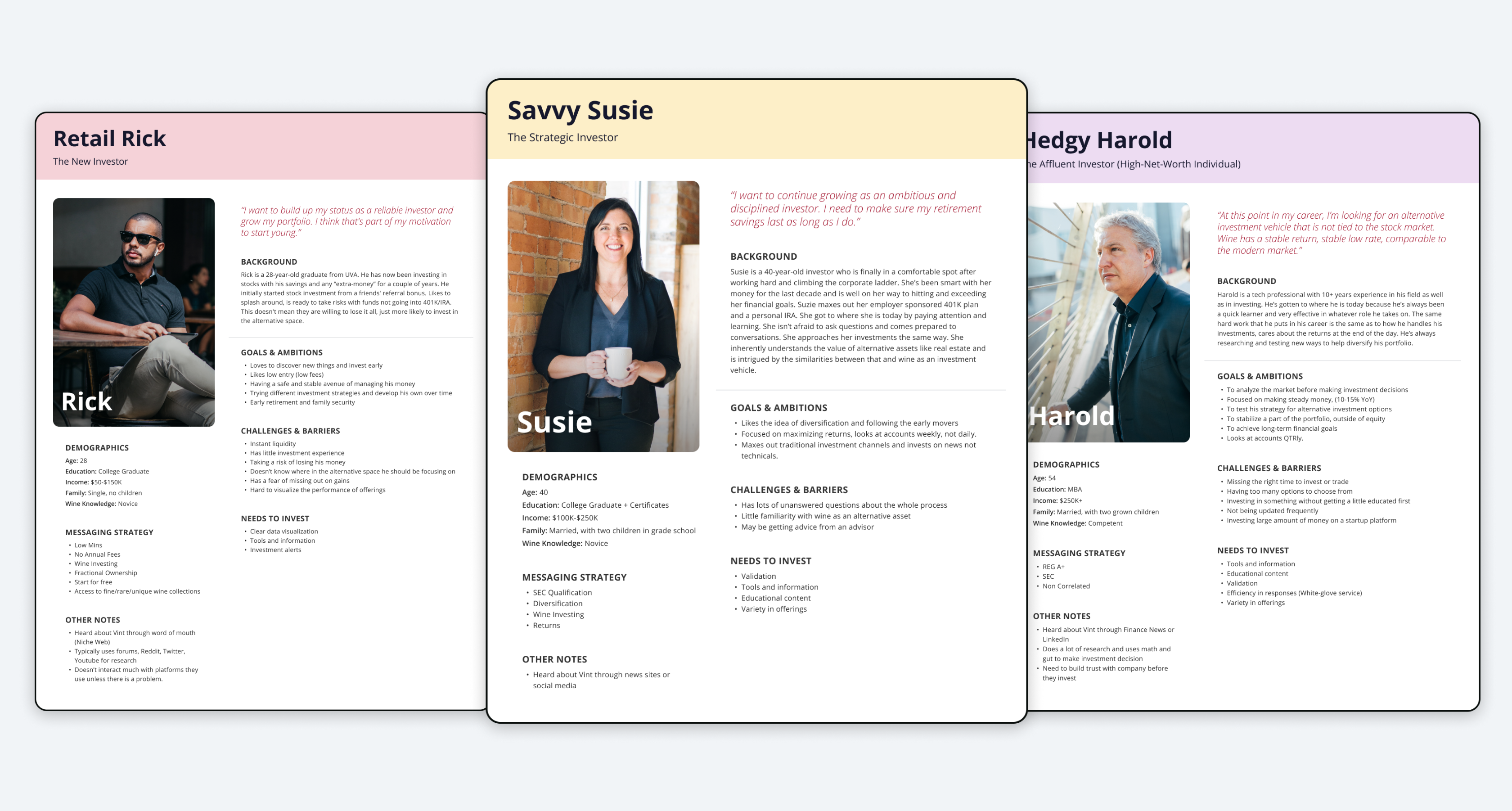
Savvy Suzy was the primary persona targeted due to her higher investment size and lifetime value compared to Retail Rick. We designed the sign-up flow to cater to Suzy’s needs, ensuring a higher likelihood of engagement and investment.
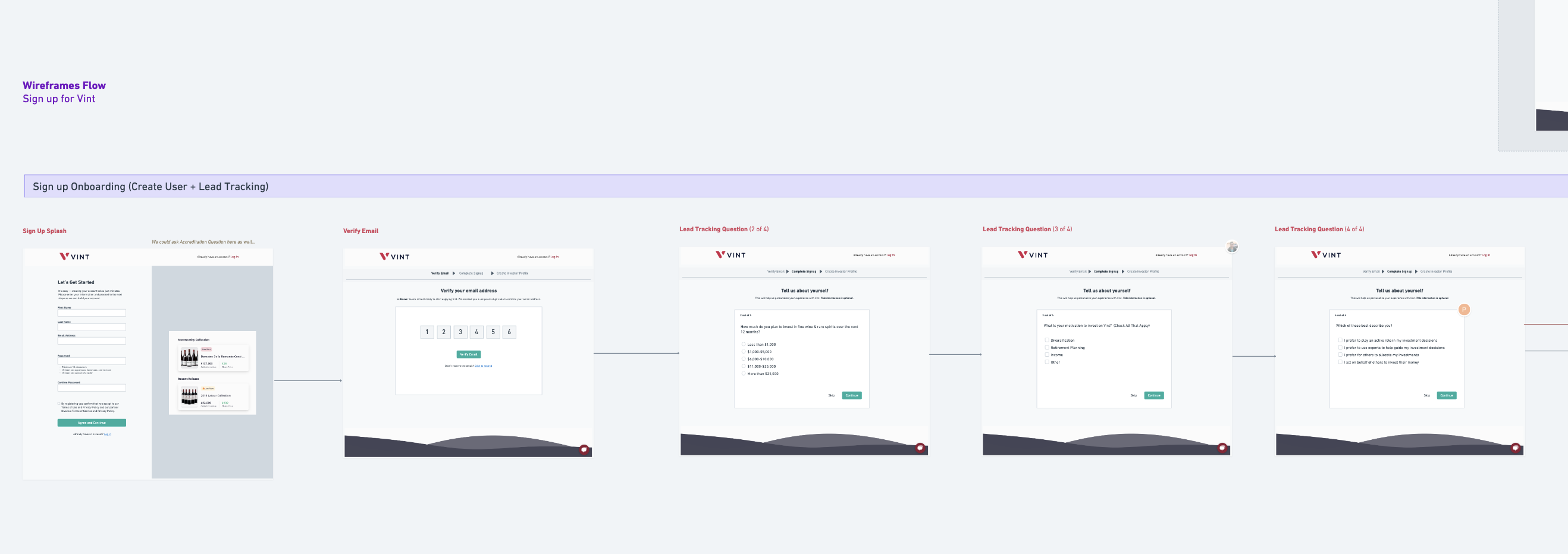
We identified three key questions to include in the sign-up flow to better understand investor motivations, investment plans, and characteristics. These questions were designed to gather valuable insights without increasing the risk of drop-off.
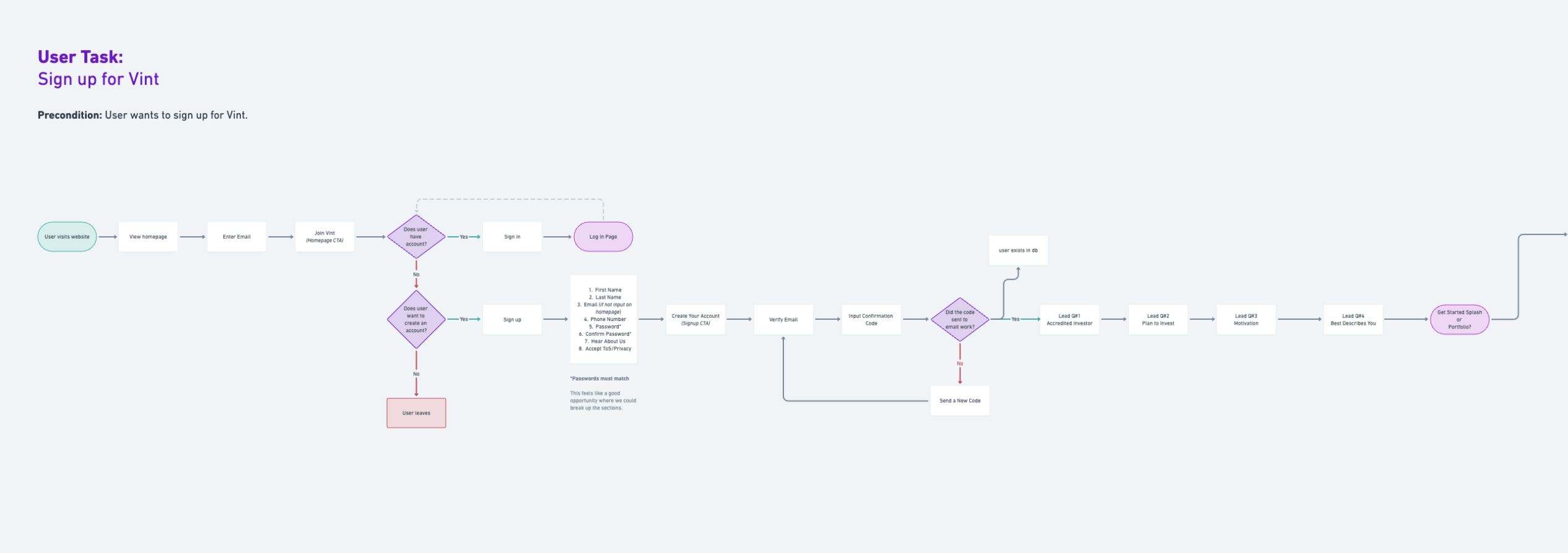
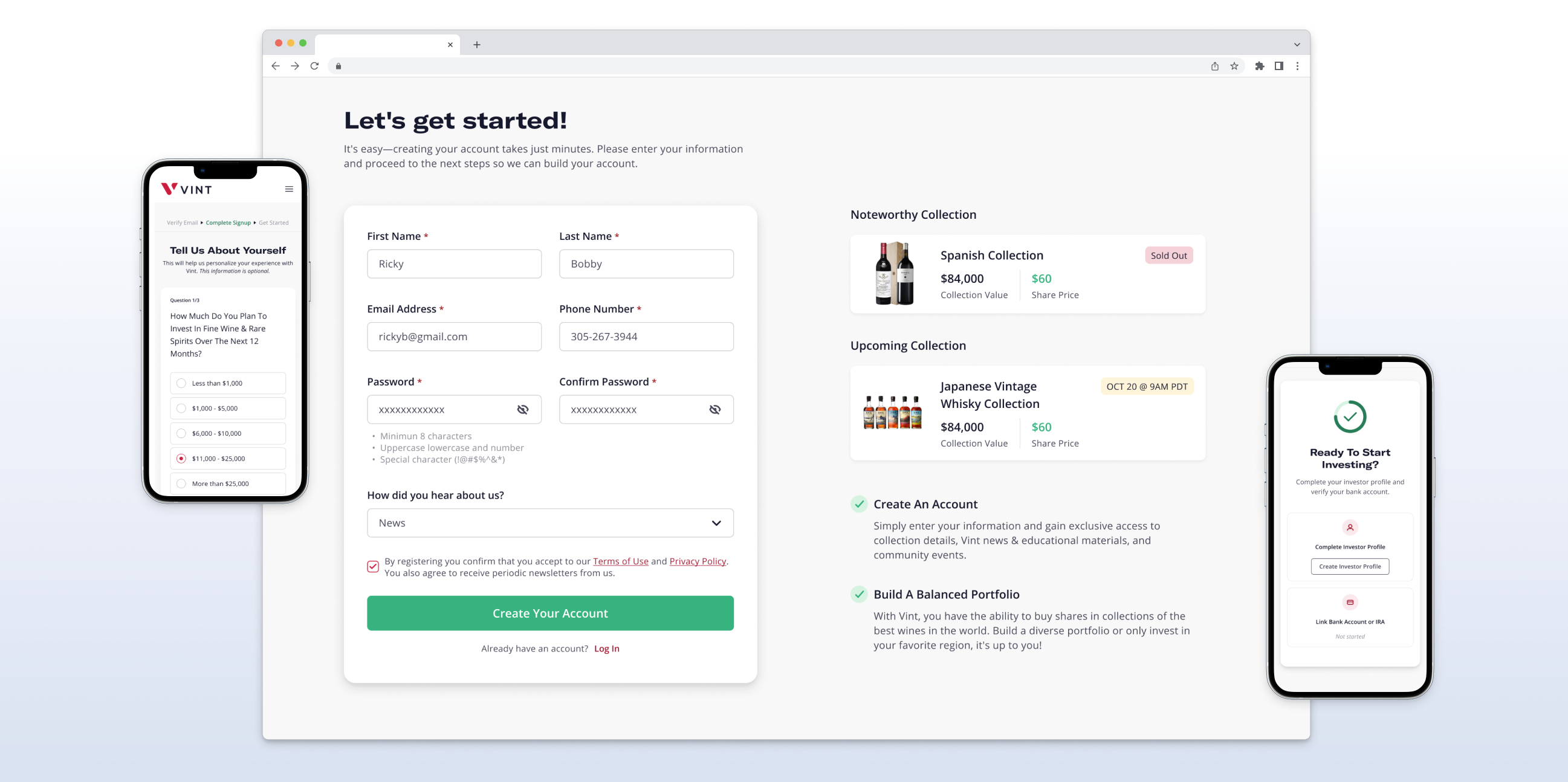
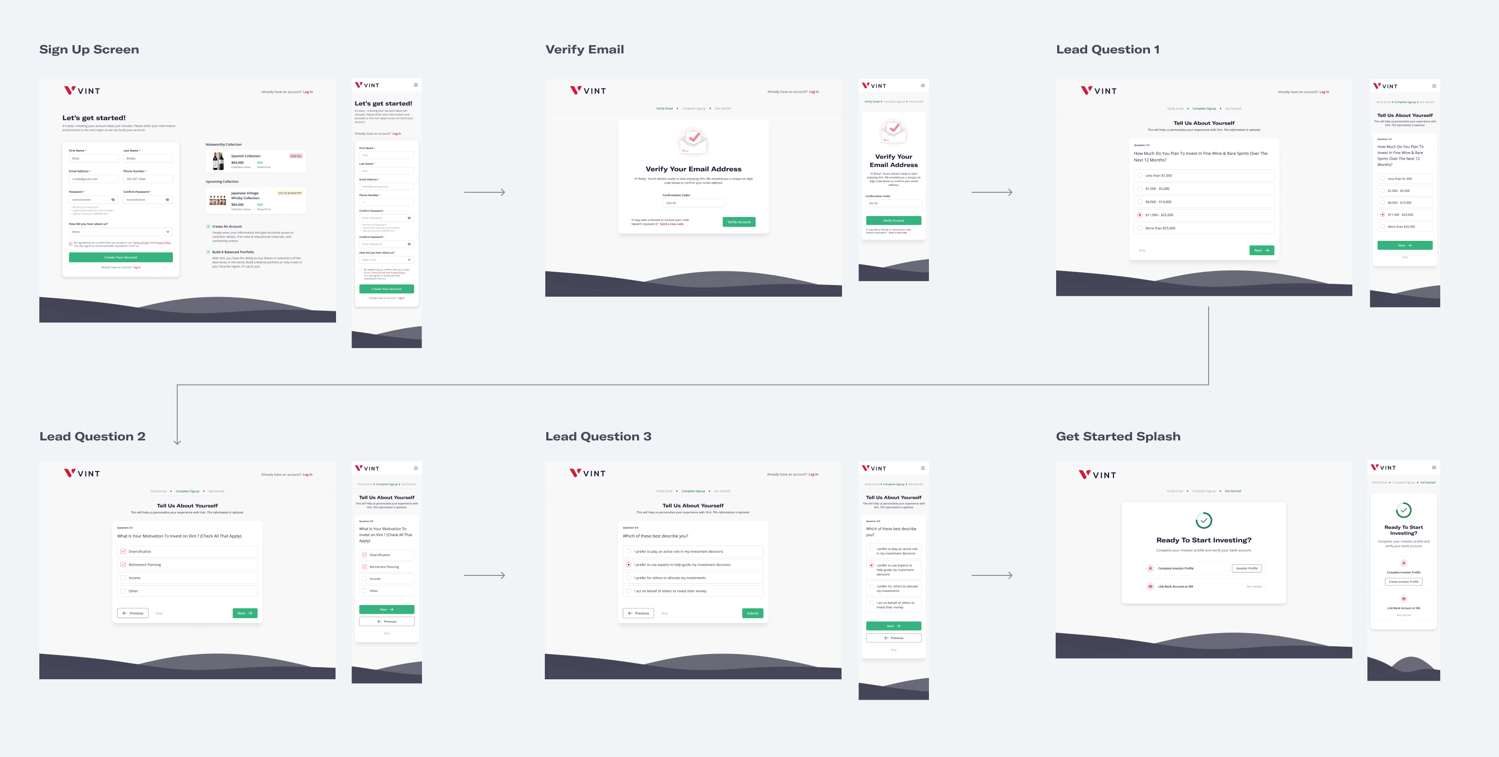
To streamline the user journey, I created wireframes outlining the new sign-up flow. This provided the team with a clear direction on how to reduce complexity while maintaining essential information collection. Collaborating closely with engineers, we refined the wireframes based on feedback from stakeholders and usability testing.
Post-launch, we saw the following improvements:
User feedback played a critical role in shaping the final design. Users preferred verifying their account before answering any lead questions and appreciated the option to skip all questions. This feedback led to the adoption of Flow #2 during testing, incorporating a skip-all button and clarifying the copy.
We focused on testing the placement of the Verification Code screen, either before or after lead questions. Usability testing was conducted through two primary flows:
- Questions pre-verification code.
- Questions post-verification code.
A user exploring investment opportunities on the platform for the first time and initiating the account signup process.
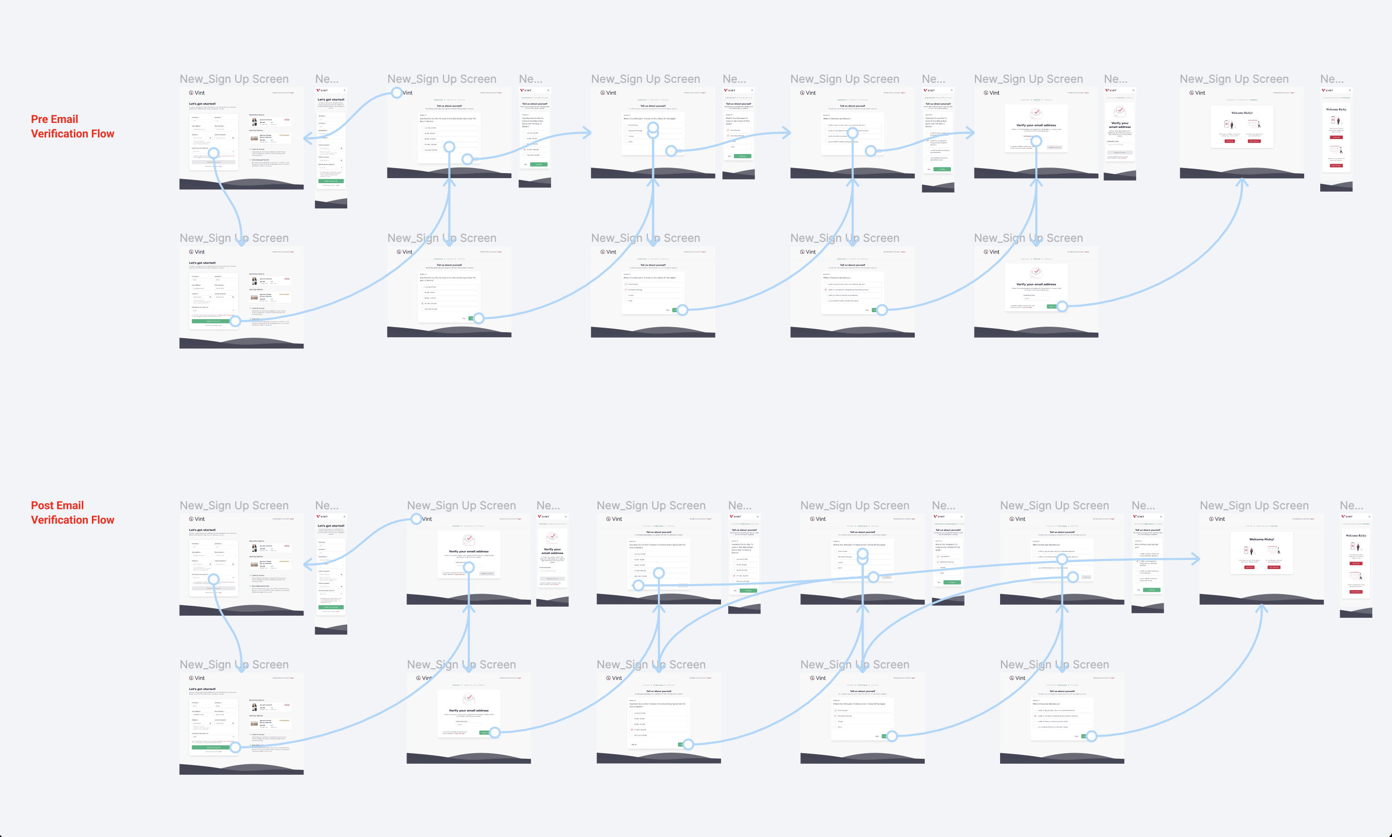
Based on this feedback, we adopted Flow #2, incorporated a skip-all button, and updated the copy for clarity.
Of participants preferred verifying their account first before answering questions
All participants liked the ability to skip questions
Of participants expected personalized experiences from answering the questions
All participants preferred one question per page over three on a single screen
