Building a simple yet effective design system for investing in wine and spirits.
As Vint expanded, we faced increasing design inconsistencies due to the absence of a unified design system. The lack of structure led to disjointed visuals and clunky user interfaces across the platform. This issue became more pronounced as the company grew, making it challenging to maintain a cohesive user experience across multiple features and platforms.
Without a design system in place, our team had to reinvent the wheel for each new feature, causing delays and inconsistencies. The platform's growth highlighted the need for a unified visual language to ensure efficiency and clarity across all touchpoints.
As the Lead Designer, I was responsible for spearheading the design system’s development. This involved documenting design decisions, collaborating closely with stakeholders, and creating a system that would support future features and enhancements as the company grew.
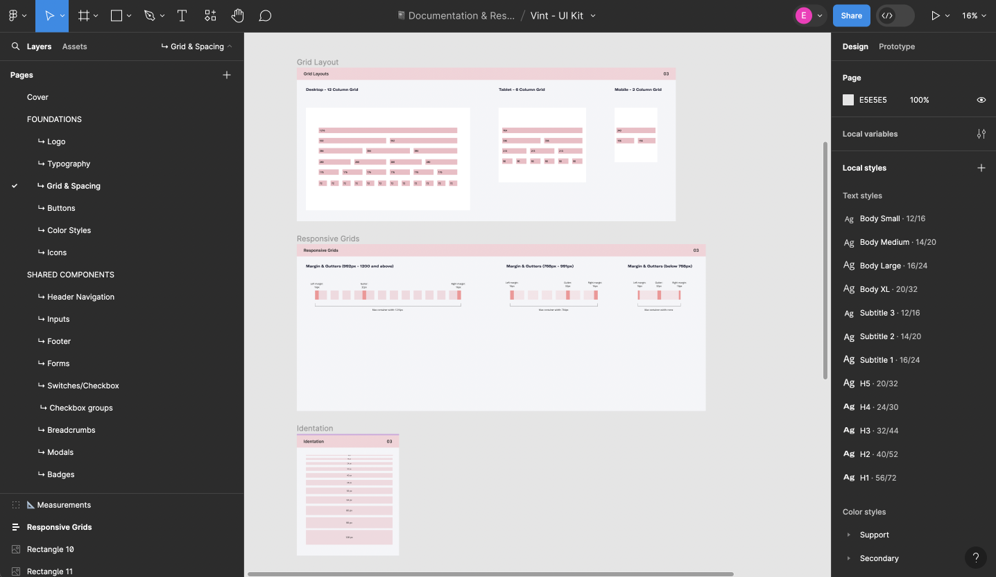
To kick off the project, I conducted a thorough audit of our existing designs across the platform, identifying inconsistencies and areas for improvement. I also gathered feedback from users and the engineering team to inform the structure of the design system. The goal was to create a system that would not only unify our design approach but also scale effortlessly as new features were developed.
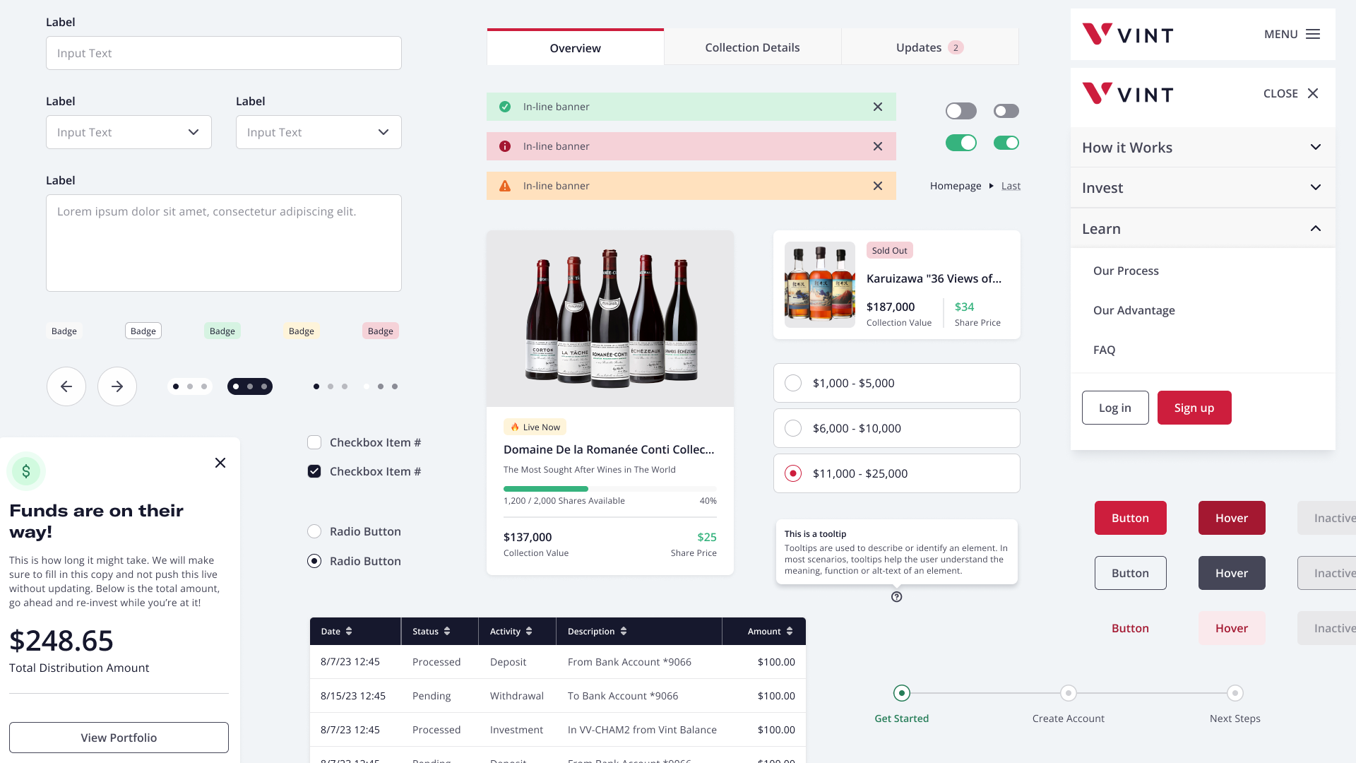
Working closely with two engineers, we developed a component library that would serve as the backbone of the design system. This included buttons, forms, and other interactive elements, all documented for easy adoption by the engineering team. The component library aimed to simplify the design process and ensure a consistent user experience across all platforms.
The library contained reusable components such as buttons, forms, and interactive elements. We documented each component in detail, allowing the engineering team to implement them quickly and consistently across the platform.
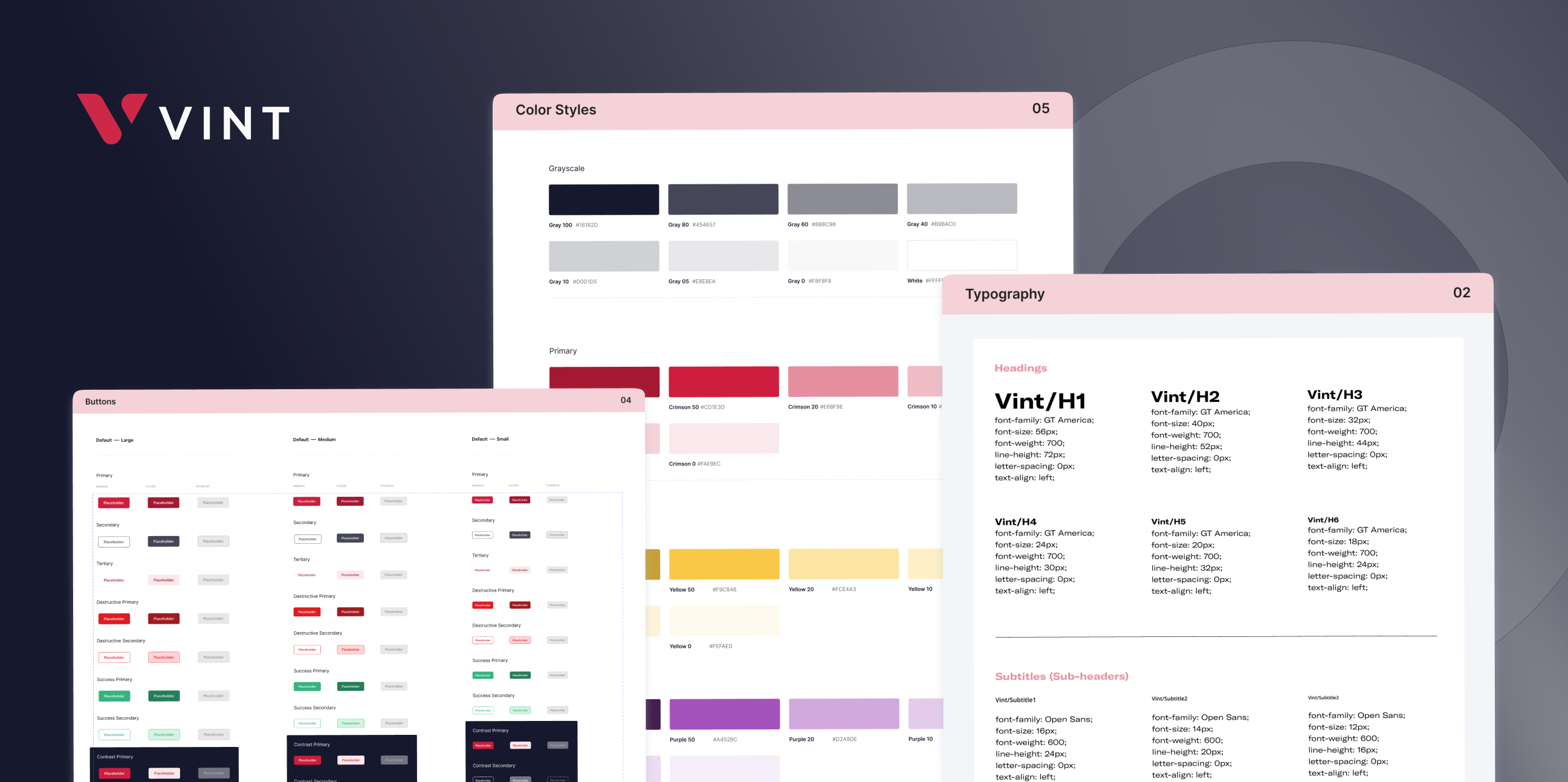
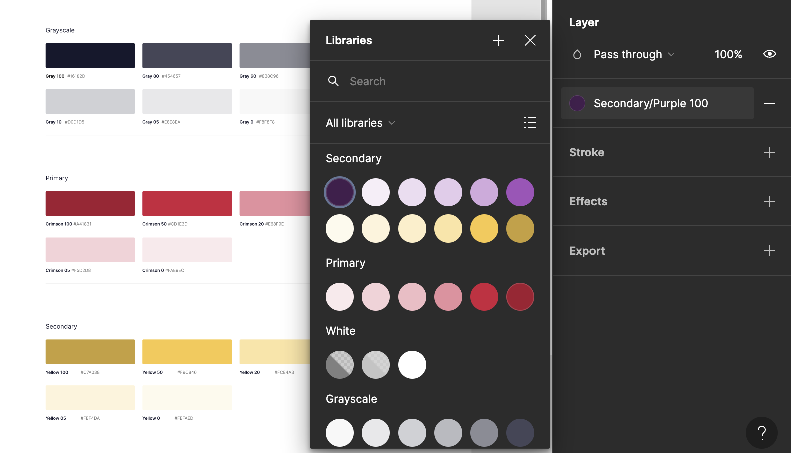
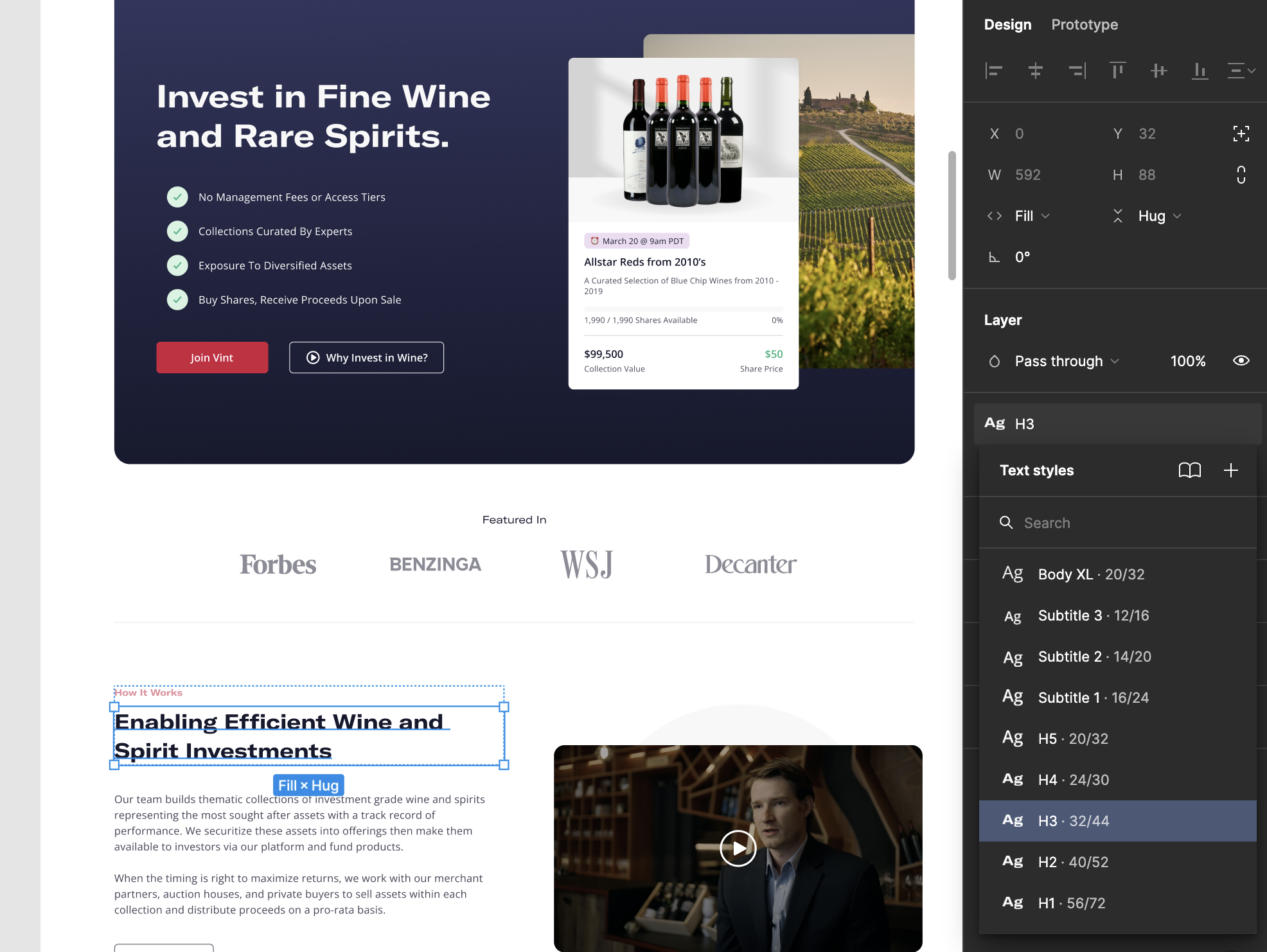
I curated a harmonious color palette that reflected Vint’s brand identity. The palette enhanced visual consistency and ensured a cohesive aesthetic that could adapt to future platform expansions.
We implemented a consistent typography system focused on readability and visual harmony. This system was crucial for maintaining a unified design style, especially as we expanded into mobile platforms.
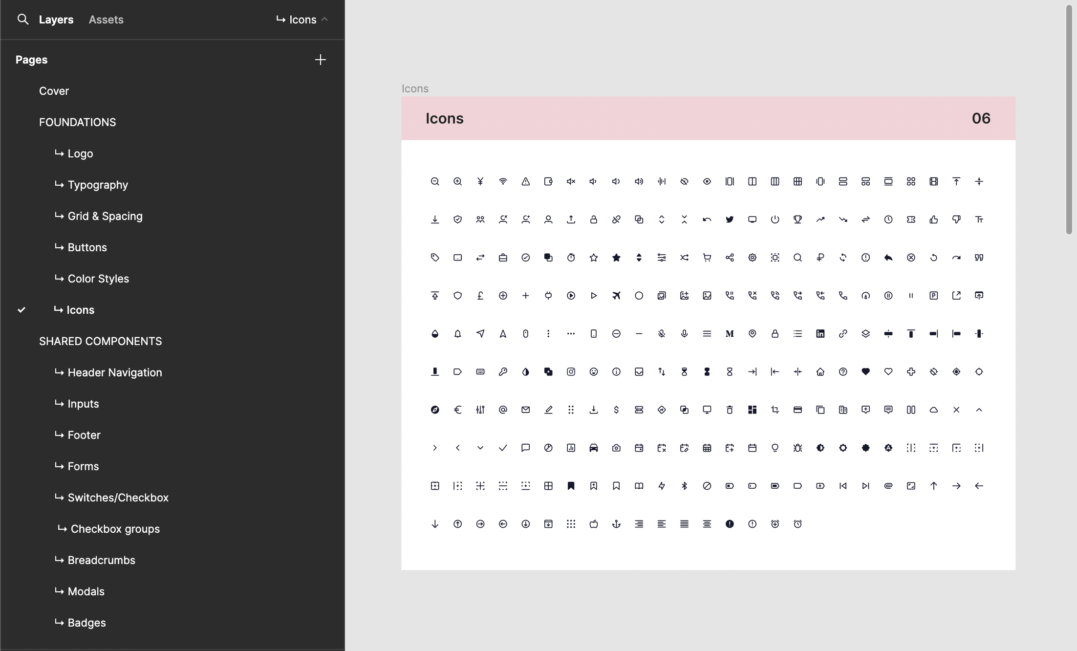
We selected the Feather icon library for its simplicity and alignment with Vint’s minimalistic design ethos. Icons were carefully chosen to minimize cognitive load and enhance usability across both desktop and mobile experiences.
Throughout the development of the design system, I worked closely with the engineering team to gather feedback on the system’s usability. Their input helped ensure that the system was practical and easy to implement, resulting in a more efficient workflow and fewer design inconsistencies.
