Simplifying a confusing and frustrating process to increase conversions and improve user satisfaction.
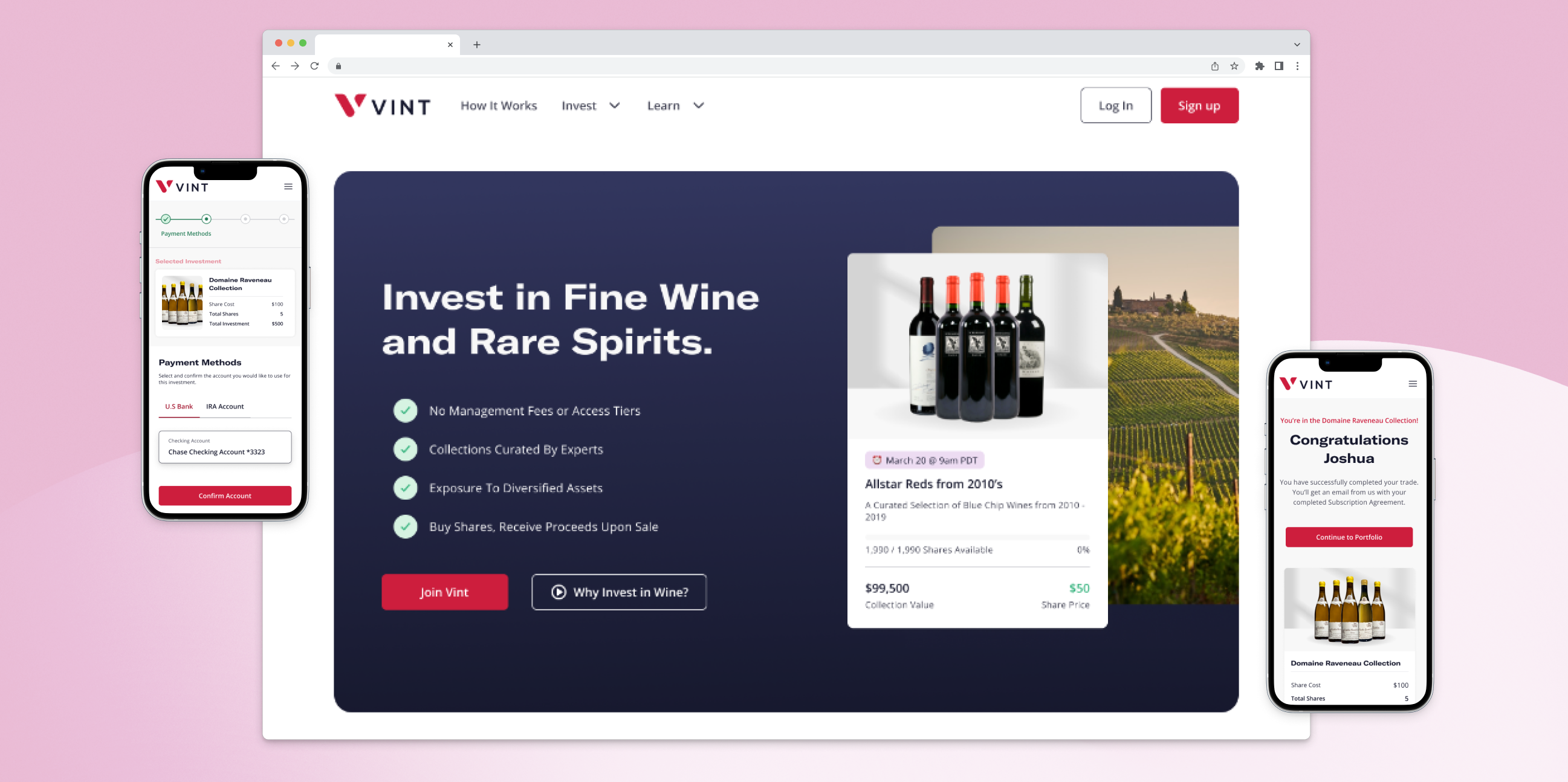
Vint, a platform democratizing fine wine and rare spirits investments, was losing potential investors due to a confusing and frustrating investment process. The journey involved selecting shares, confirming the investment account, and signing a subscription agreement using a frequently malfunctioning DocuSign feature. Investors were dropping off at critical stages, leading to a significant loss in conversions and engagement.
As the Lead Designer, I spearheaded the redesign of the investment experience. My tasks included conducting discovery research, prototyping, and usability testing, all while collaborating closely with engineers and stakeholders. I was also responsible for defining the success metrics that would shape the project’s outcome.
The biggest challenge we faced was a multi-step process that left users confused and frustrated. The DocuSign feature frequently broke, causing many to abandon their investments midway. Our task was to clear up this confusion and make the experience much smoother for investors.
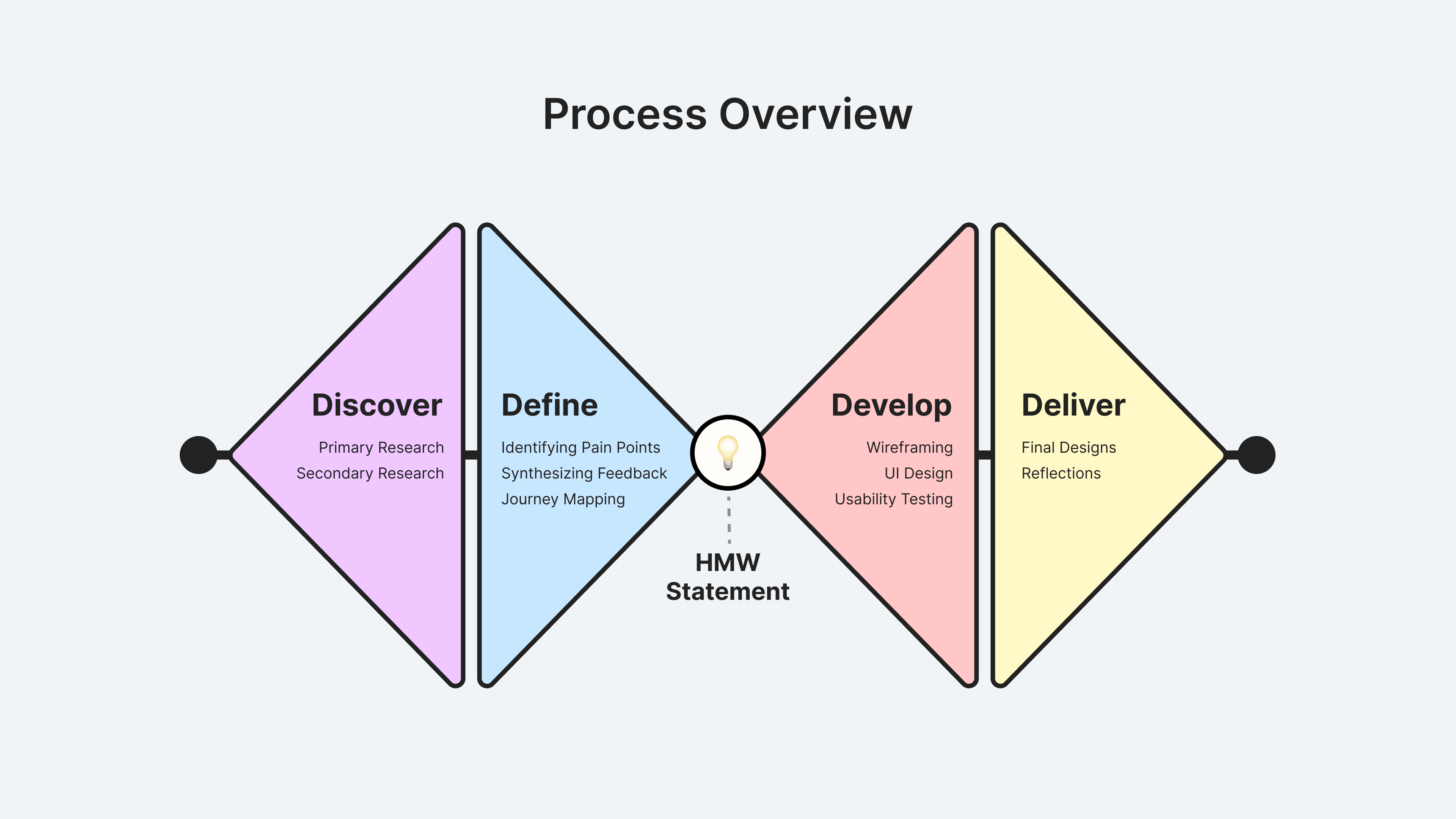
I began the investment experience redesign by collaborating with business and tech stakeholders. After pinpointing current issues and tech constraints in the current experience, I crafted a research plan. The redesign process began with an extensive research phase. Through competitive analysis and user surveys, we gathered key insights from over 430 investors:
My objective was to understand user needs and pain points, informing our small team's roadmap for future platform enhancements.
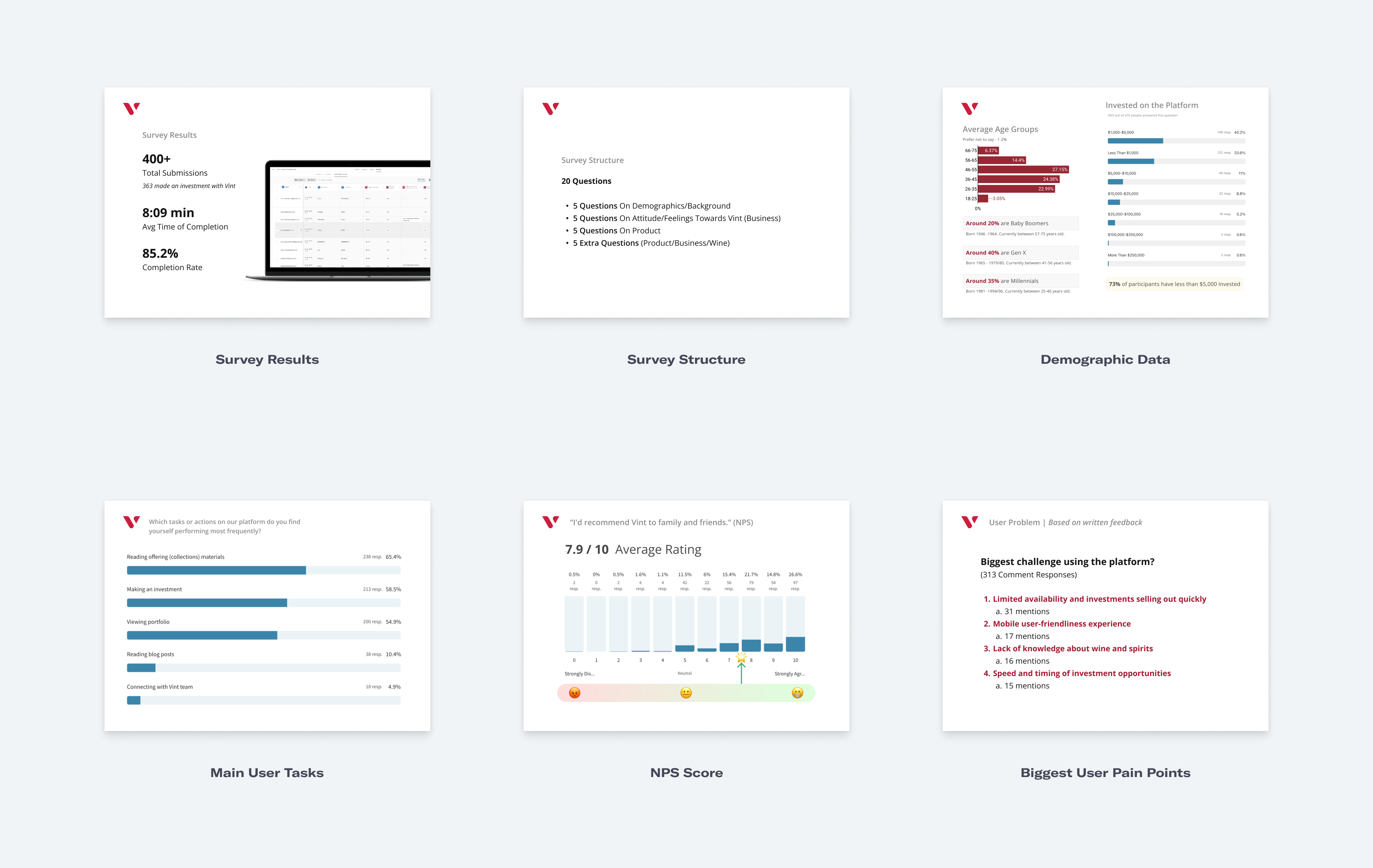
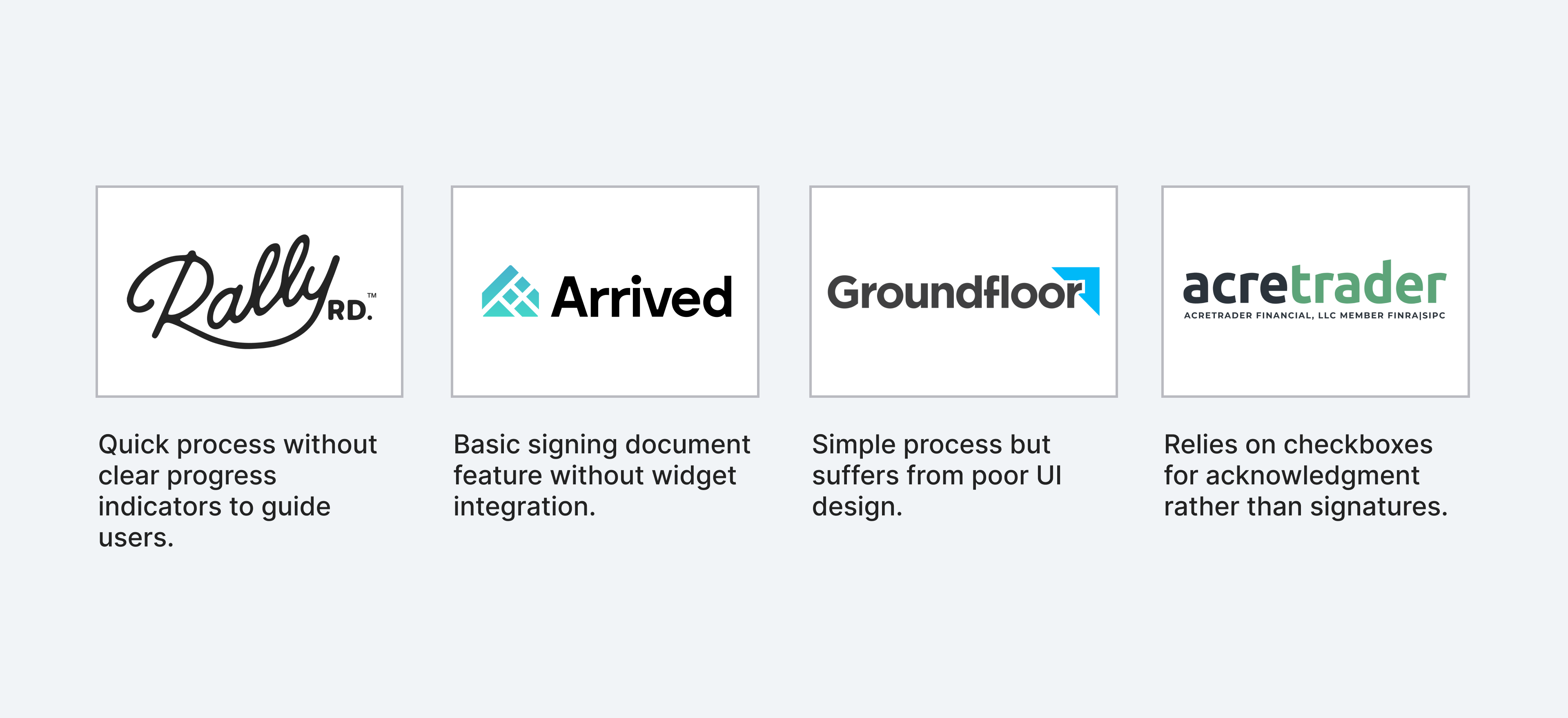
The analysis encompassed a wide array of competitors within the alternative investment and finance sector, examining their offerings, user experiences, and key differentiators.
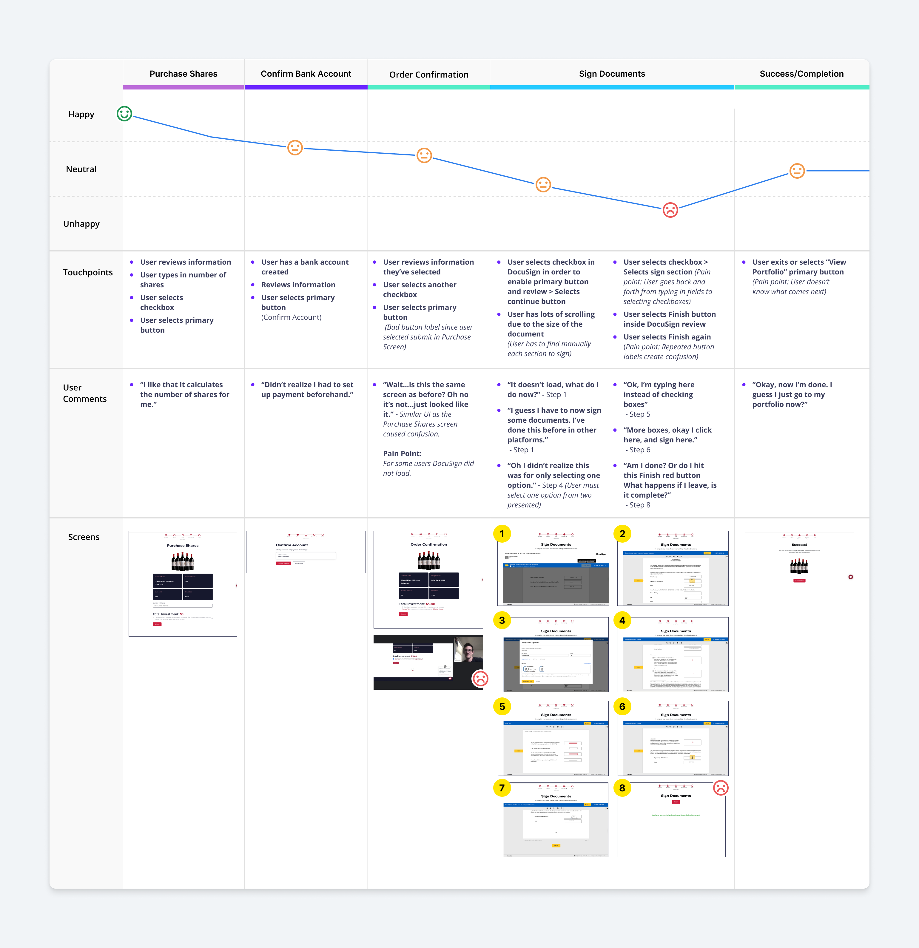
One of the most impactful tools during this phase was a journey map, which I created based on user interviews and feedback from the survey. The map visually demonstrated the exact points of confusion and frustration that users faced throughout the investment process. Presenting this journey map to stakeholders was crucial in showing just how painful the experience was for investors and helped secure their buy-in for the redesign.
"How might we simplify the investment process for users of Vint, while ensuring compliance and reducing friction associated with document signing, ultimately enhancing user satisfaction and driving engagement?"
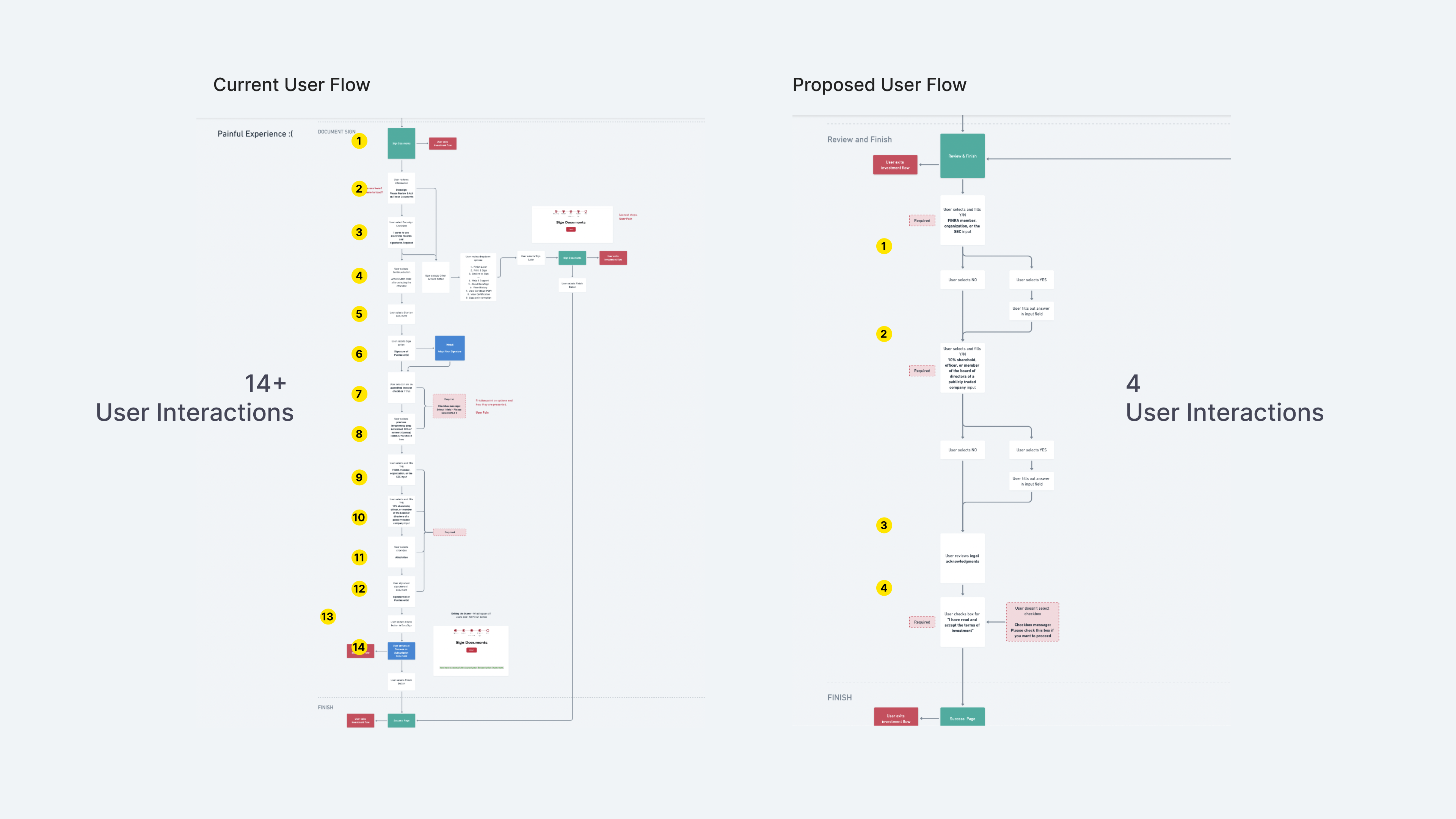
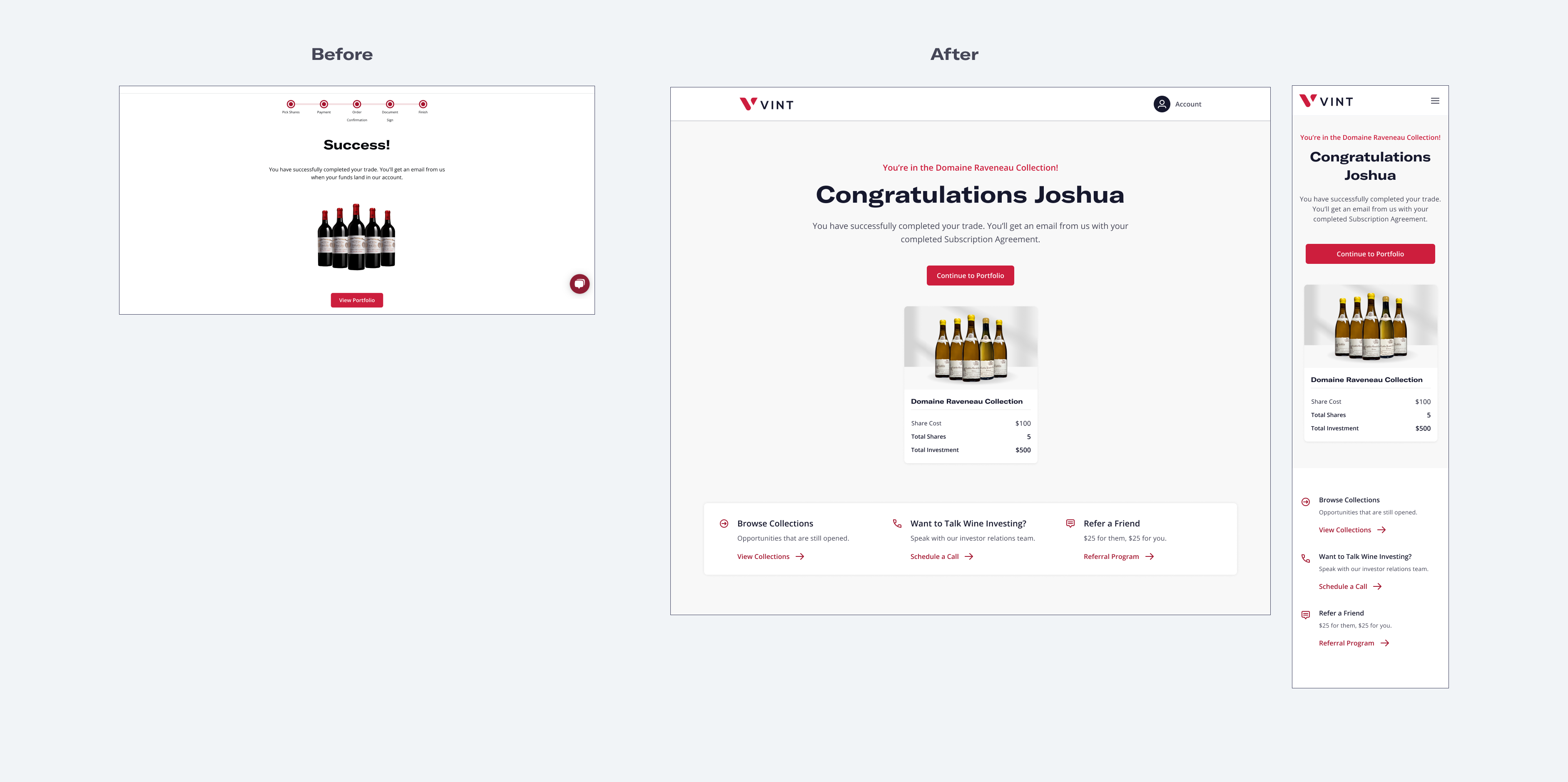
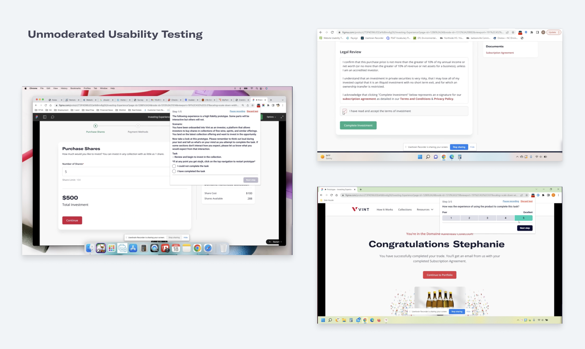
We removed DocuSign from the flow entirely, reducing the number of steps from over 14 to just 4. I began the design process by creating mid-fidelity wireframes to map out the new user flow. These wireframes helped align stakeholders and allowed for quick iterations based on feedback from the team.
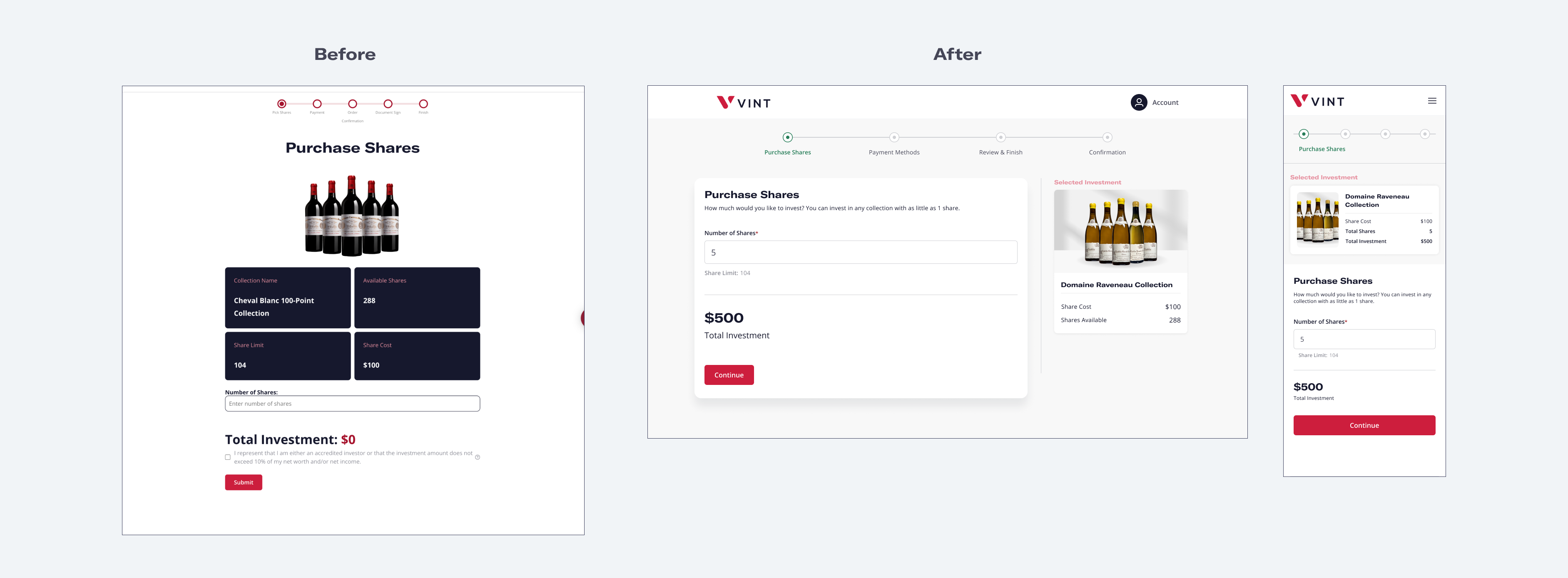
We simplified the UI, focusing on clear navigation cues and streamlined form fields. The redesign centered on user clarity, reducing confusion and ensuring investors felt confident moving forward.
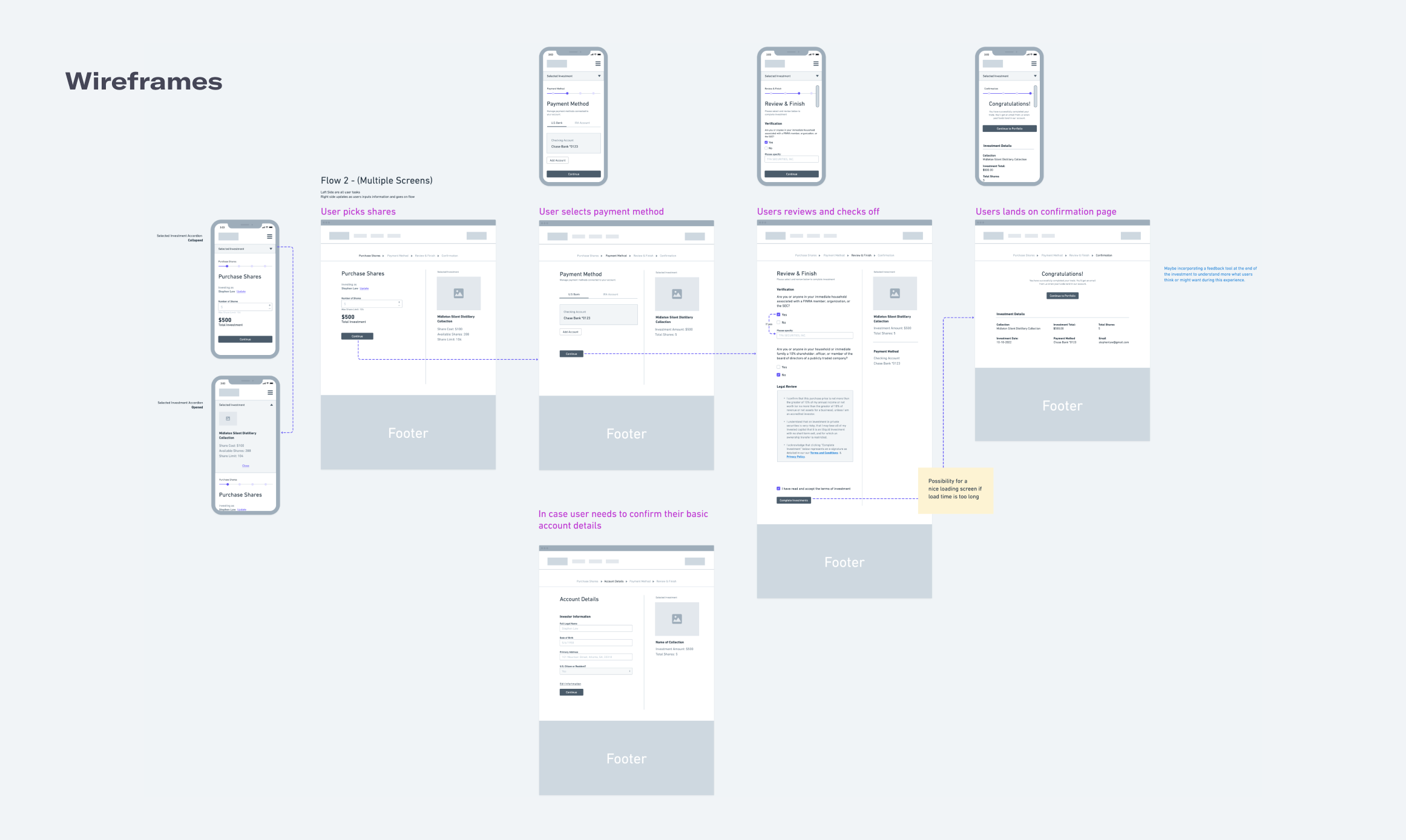
I redesigned the user interface to align with our updated brand guidelines, addressing identified pain points from the research phase. Multiple design iterations were crafted, incorporating stakeholder input along the way.
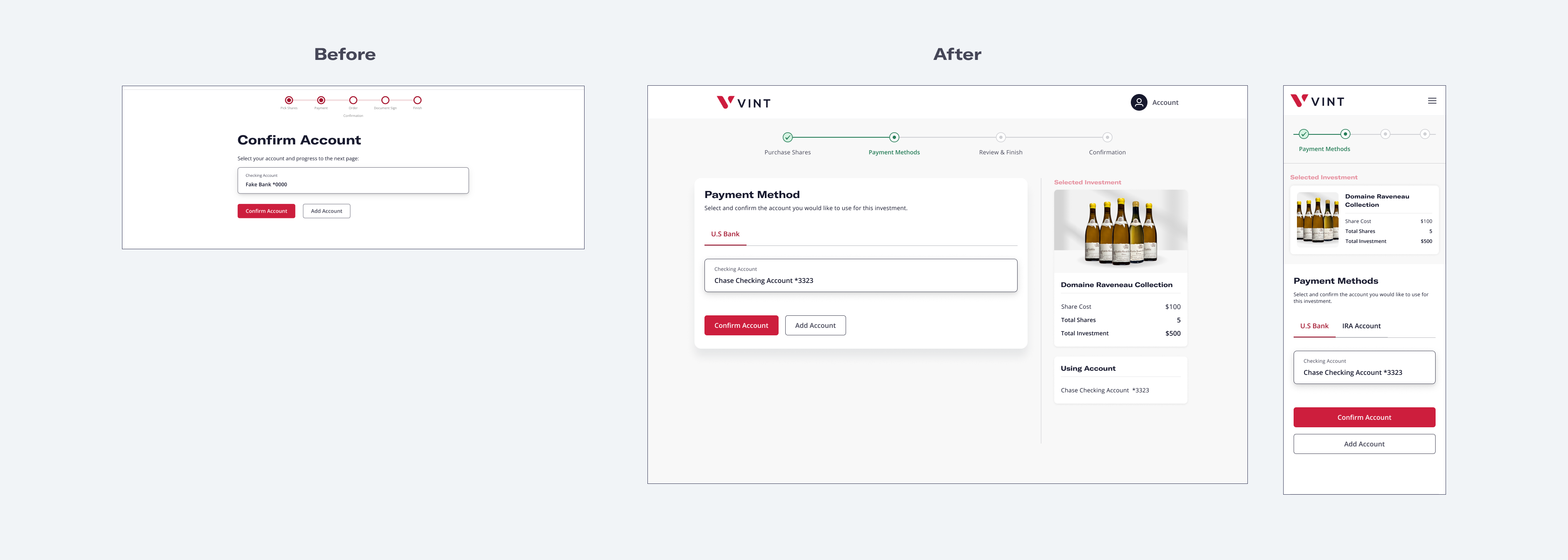
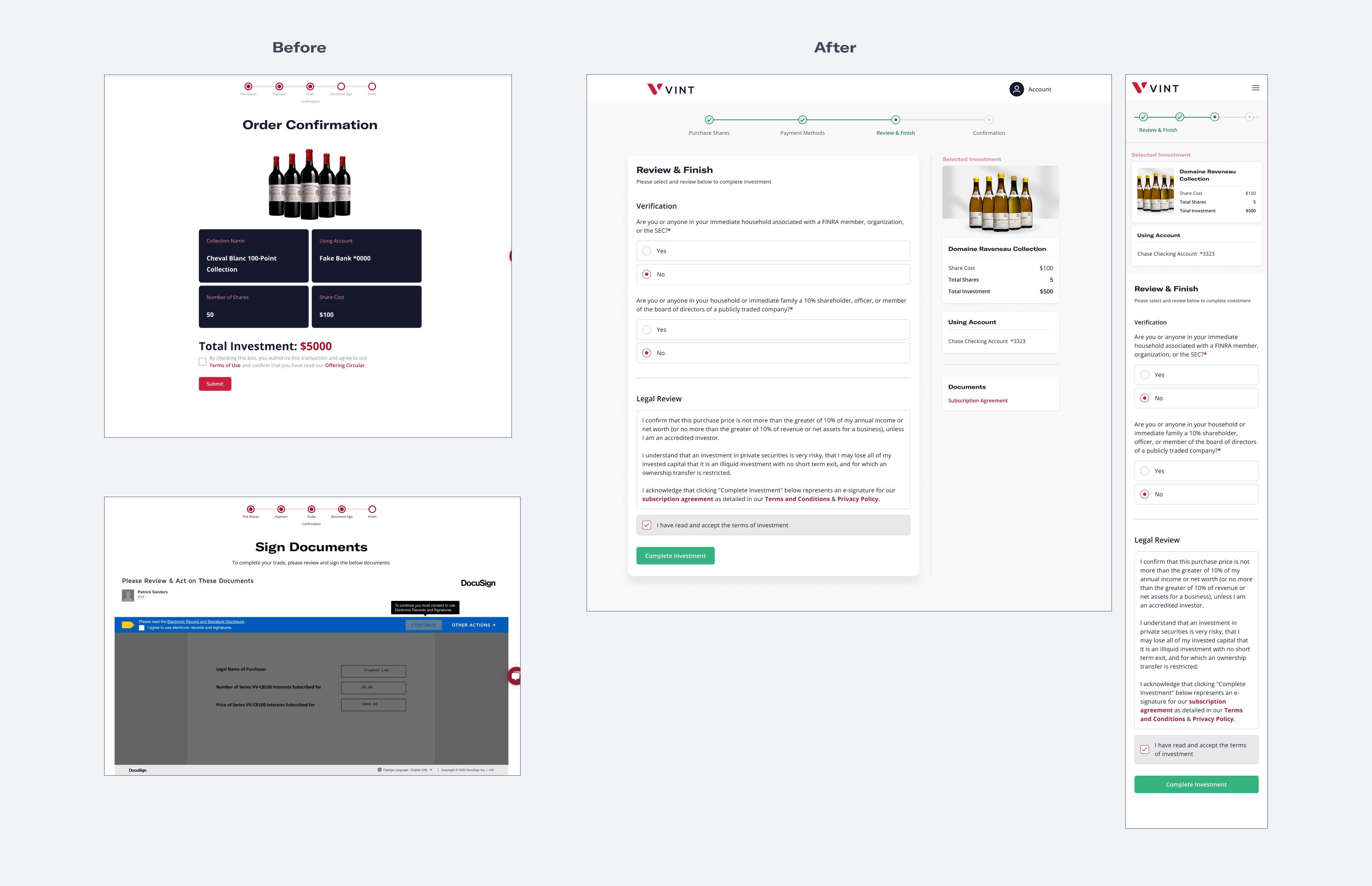
Our first iteration of the prototype received mixed feedback during usability testing. Users found the new flow less confusing, but still expressed frustration with overly detailed form fields. Their feedback prompted a second round of design revisions, which ultimately led to a more user-friendly final product.
This project taught me the value of early collaboration with the companies stakeholders and legal teams to ensure compliance without overburdening the user. It also reinforced the importance of validating design decisions through continuous user testing and feedback. Finally, I learned that sometimes the best UX decision is to remove a feature rather than fix it, as in the case of DocuSign.
By removing unnecessary friction points and simplifying the investment process, we increased both user satisfaction and conversion rates. Additionally, eliminating DocuSign saved Vint substantial costs, showcasing the power of user-centric design to benefit both the company and its customers.
